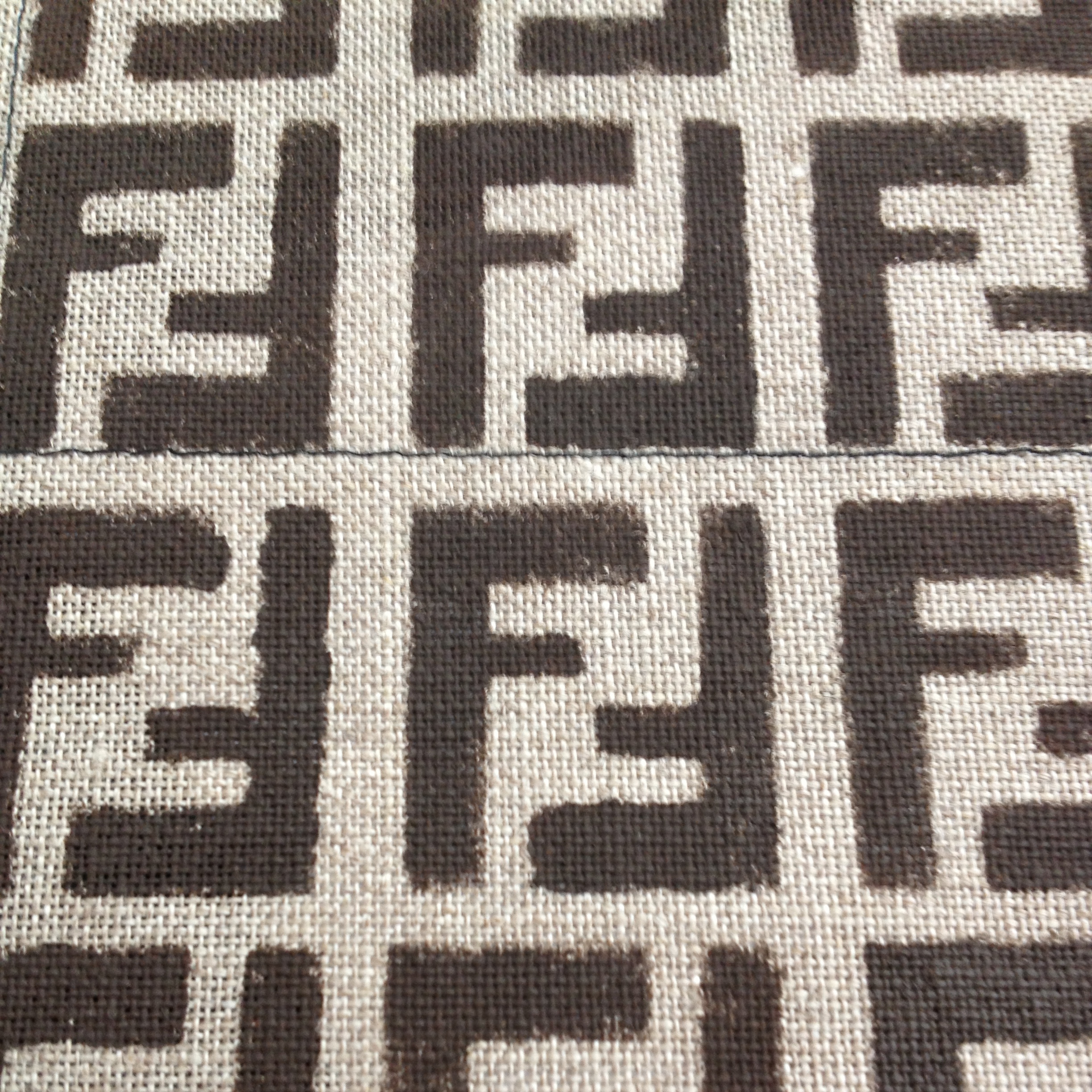
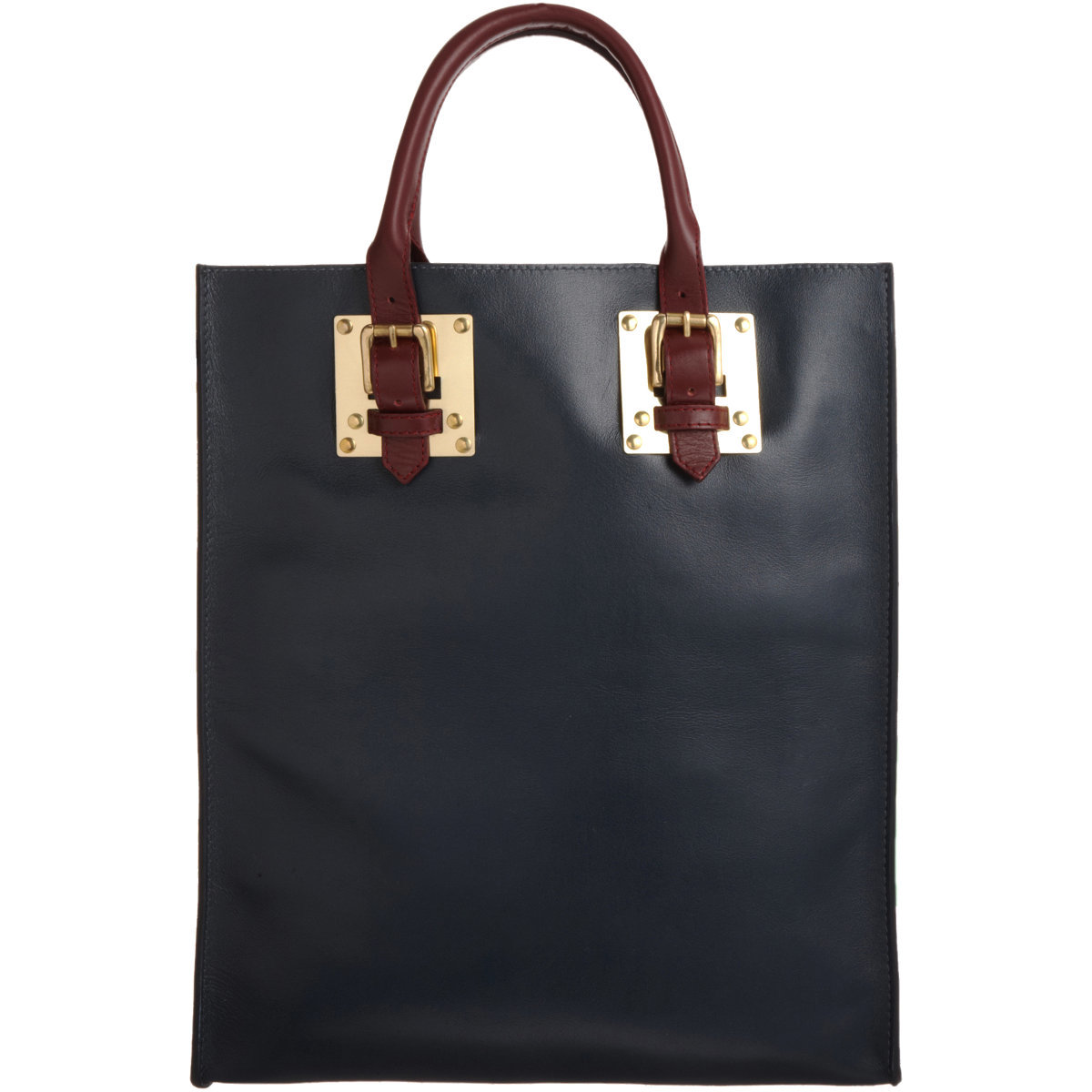
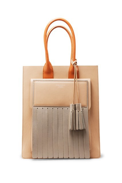
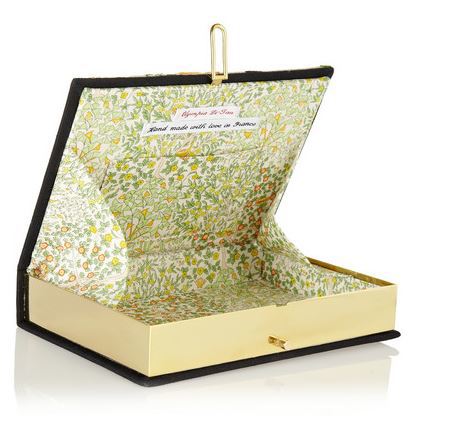
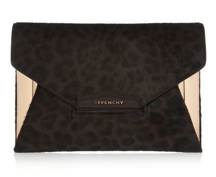
So I need a new handy bag, for the carrying around of my laptop.
**This project has been relocated in Granny Corner, its kind of like totally Granny Corner***
And I have taken a fancy to one in the style of a "well-known-fashion-house". So of course I'm going to make it myself! Sheesh! But I'll do mine the artworker way: labour intensive custom stencil pattern & embroidery, yay. And that's before I even make the bag!
It's a very simple design and I'm most certainly not the first woman to hanker after one of these handy bags... I'm not sure why. I must be victim to advertising and peer group pressure, combined with low self worth that needs bolstering by external signifiers of prestige. Or, I need a new bag and am motivated by both financial and aesthetic reasons to make my own one, but one sort of like these.
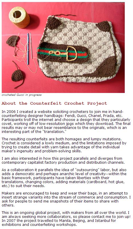
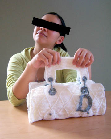
As a matter of fact, the idea to DIY a designer bag is nothing new. See counterfeitcrochet.org, a great example. A project of artist Stephanie Syjuco and begun in 2006, The Counterfeit Crochet Project was "a global collaborative project with crochet crafters to counterfeit high-end consumer goods" like designer fashion handbags, of course. Her interests centered on issues of piracy and bootlegging as they apply to today's globalized economy and she has created many sculptural works and installations based on this topic. Including this very fun crocheted democracy project!
And she has this to say about it: (please bear with me, inserting the following info; it's interesting, really!)
"Are you admiring or making fun of designer labels?
Both! The media machine pushes onto the public the desire for luxury goods. Celebrities tote high-end purses, and slick glossy ads amp-up the sexiness factor. Fashion is fun fun fun! But at the same time, most of us "ordinary people" can't afford such things, and some even knowingly buy knock-off products to sublimate our desires. If you take the logic one step further, and actually make the item yourself, you are in a sense taking the situation into your own hands without giving a single penny to the company brand. They have excluded you anyway, by keeping their prices astronomically high.
But doesn't this just give more power to the logo? How is this really resisting commodification if you're just repeating the logo?
Tough question. The jury is still out on this one...I personally find it fun and funny to try to translate high-end designer goods into a rather "lowly" medium. You could make the argument that it means the logo still has power over me and everyone else who chooses to repeat it. But then again, this type of handmaking goes against the grain of the standards and specifics of the corporate design. Brands are incredibly possessive of their logos and they do not take it as "flattery" when they are counterfeited."
Meh. I'm kinda hoping they wont bother noticing me at all.
But I dont crochet. Gasp! Yes I knit, but crochet is Just. Not. My. Thing. Sorry.
So I love this idea and I like fancy goods and I need a new laptop bag for the carrying around of my laptop. And I keep thinking.
Thinking: designer "brands". Thinking Chanel. Nah, too obvious. Thinking Loius Vuitton. Nah, too done.
I'm thinking Missoni, my favorite all time label. Mmmmmm, Missoni; this is an idea I'm keeping on the backburner for now. I'm still thinking about this.
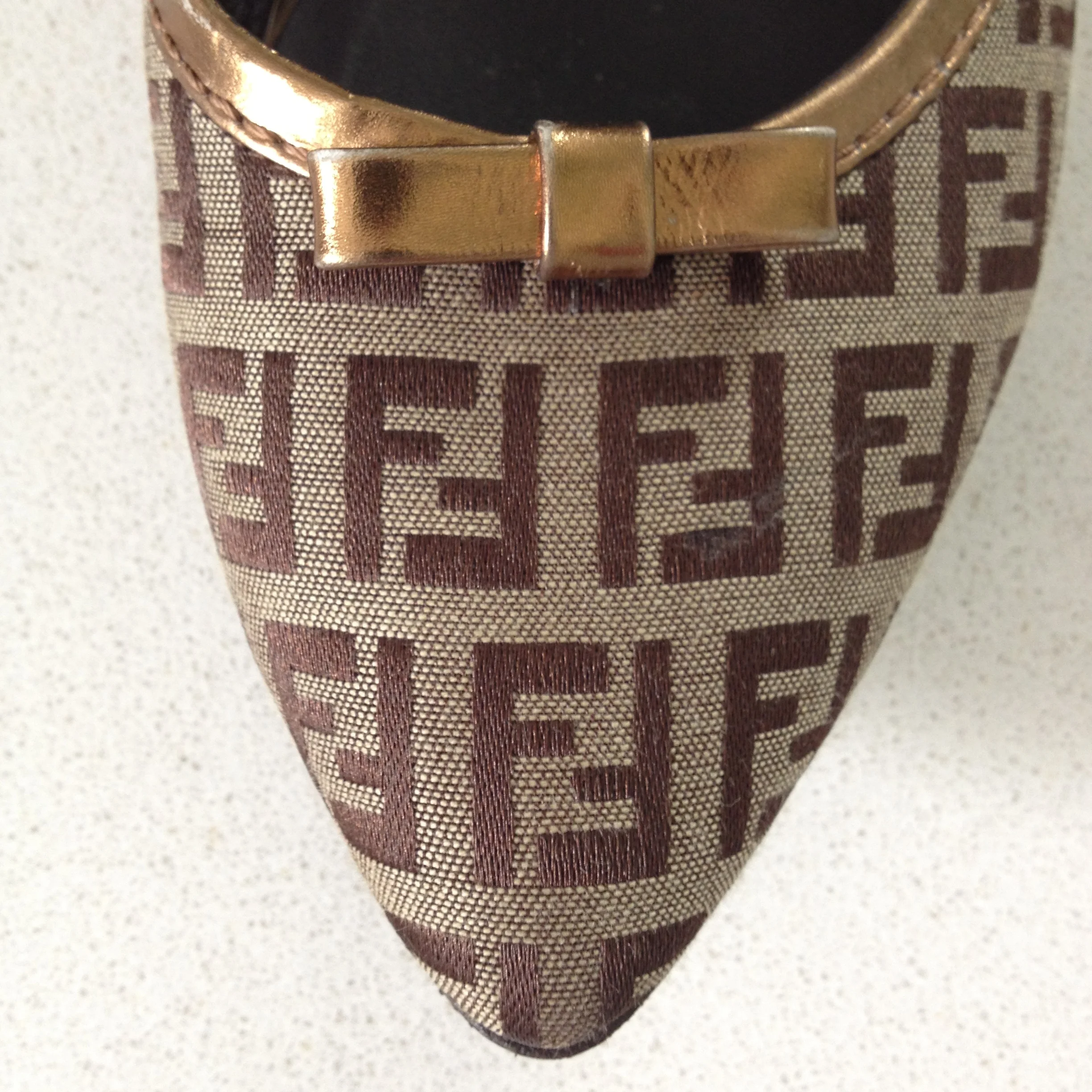
I'm thinking Fendi. And I'm thinking how this brand is using one of the best, most successful workaday typeface/fonts that says it all, across all shades of modern corporate endeavour, and I'm sold! Fendi, yay! And it's eeeeeeasy.
Because of which font do I speak? Behold:
HELVETICA.
It's uncomplicated and truly versatlie and all pervasive.
You'd be surprised how many businesses across all spheres of industry use this font in all it's many typefaces. Matter of fact, yessiree, Fendi shares a typeface with Target! Omg! So, in fact, do Comme des Garçons. Omg omg. AND, American Apparel reported a sales boom after adopting the typeface. All Mr Largerfeld did with Fendi in 1965 was turn one letter upside down beside another one that's not upside down. Clever him. But firmly cementing Helvetica as very cool: Mad Men. Yep, its used in the Mad Men title.
We’re talking about the world’s most recognizable font: Helvetica. Its relevance in design through the years and even today seems unbeatable.
The appeal for a distinctive, professional and timeless typeface has never dwindled and it keeps gaining more followers day by day. Love it or hate it, with its multitude of styles and versions, Helvetica is here to stay."
In fact in fact, how's this for a claim: *"Helvetica may be the biggest ignored piece of modern art in current society." Wow!
Typeface/font design and history is pretty fascinating stuff. For instance, I read that this typeface was originally called "Neue Haas Grotesk", but that failed to catch on. I find this a delightful name for a font! But Helvetica is a great word to say, over and over, lots of times, it sounds great. Helveticahelveticahelveticahelvetica.
Terminology wise, to be clear: in type a font is the delivery mechanism and a typeface is the creative work. Or, font is what you use, and typeface is what you see. So, when you talk about how much you like a tune, you don’t say: “That’s a great MP3”. You say: “That’s a great song”. The MP3 is the delivery mechanism, not the creative work; just as in type a font is the delivery mechanism and a typeface is the creative work. I know this, but I still get them mixed up anyway, dammit.
So nothing too complicated about reproducing this typeface. I would stress here that this project is for my personal use! I have no intention to market or make further items like this! There is no personal profit intended here! Please, LVMH lawyers, believe me, its just for me!!
I want to make a carry bag for my laptop! Still! I found heaps of free patterns and tutorials available online for sewing a tote bag and it's pretty simple. It happens that I sew a lot, actually. But this tote bag thing is not complicated enough for me! No, I wanted to make one with a hand printed, hand embroidered all over patterned fabric, in fact. Yes, make my own customised fabric.
For an all over pattern stenciling is a super low tech method for rapid hand made repeats and I like embroidery. I was taught this wonderful discipline as very young girl and have continued to do it here and there ever since. This project is made for showcasing those very ordinary embroidery skills of mine. Conclusion: my fabric will be covered with a printed typeface pattern and embroidery detailing. Done.
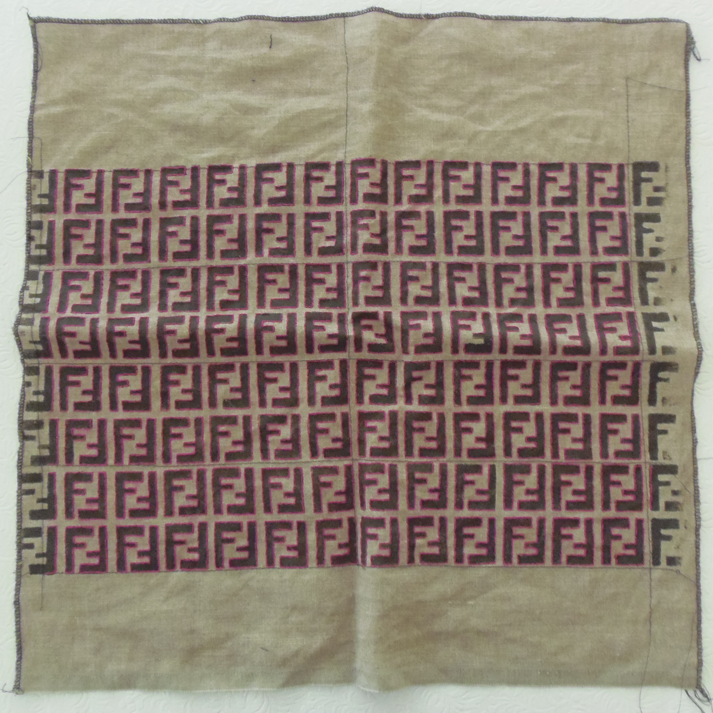
So, I started making....this:
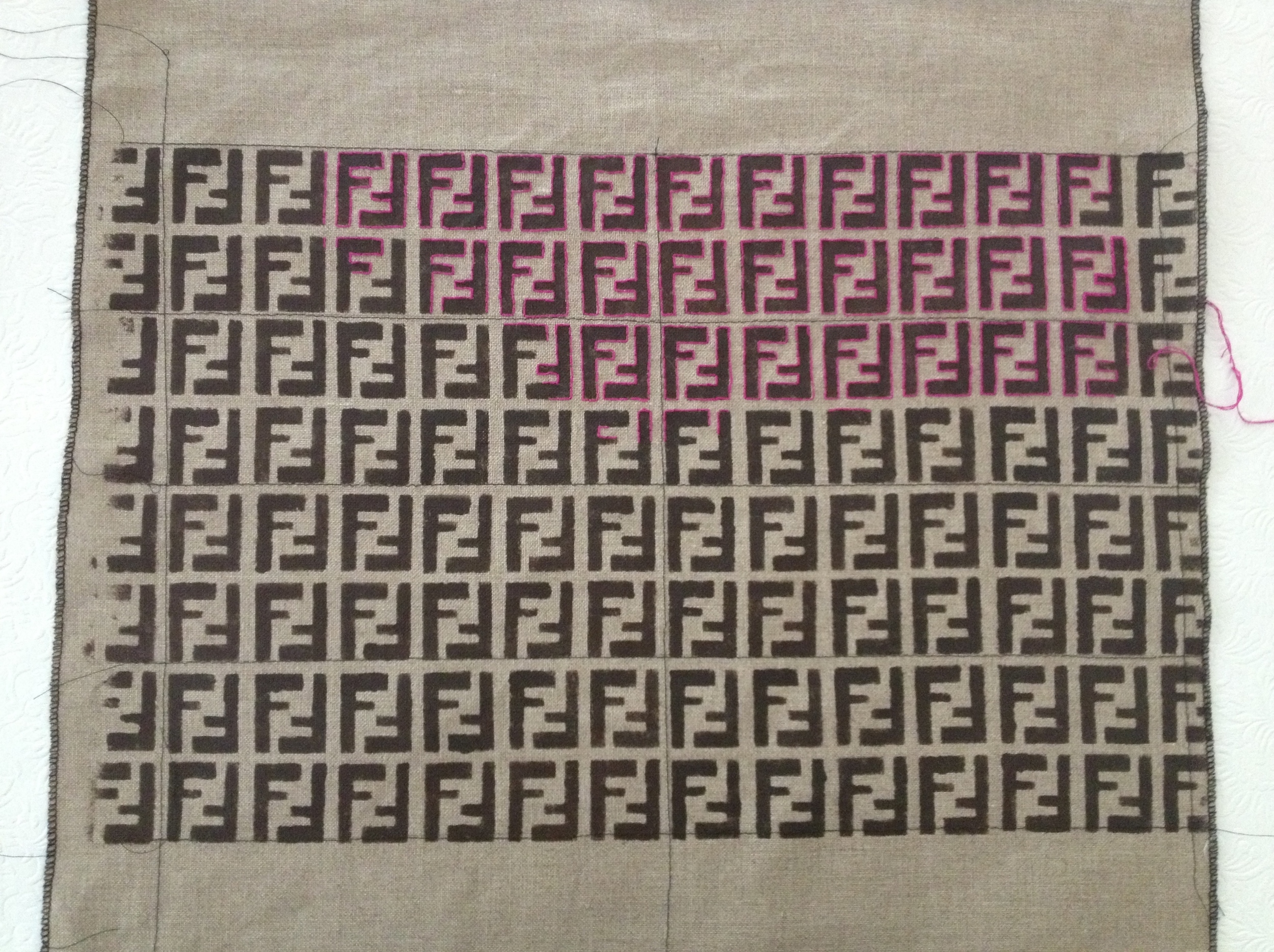
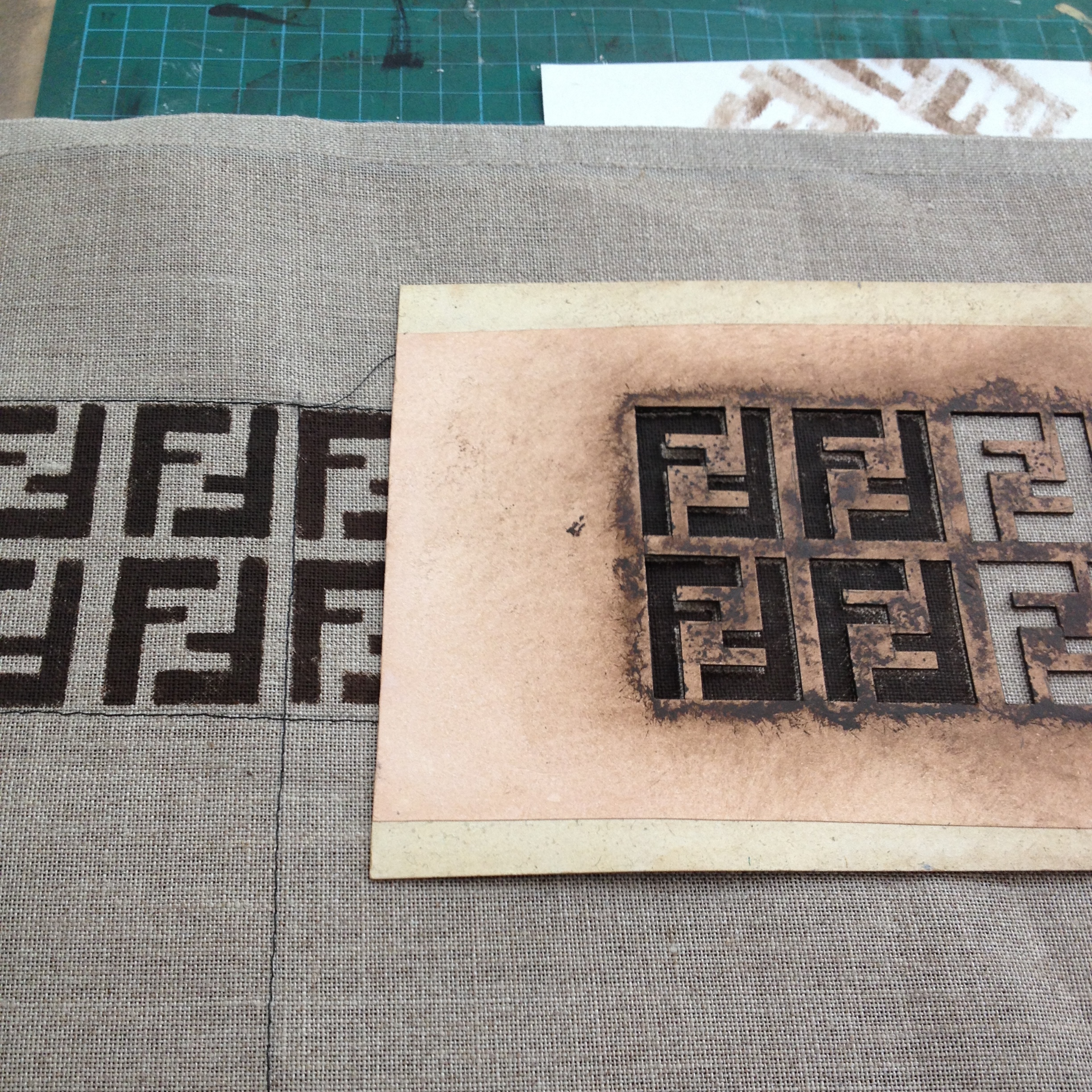
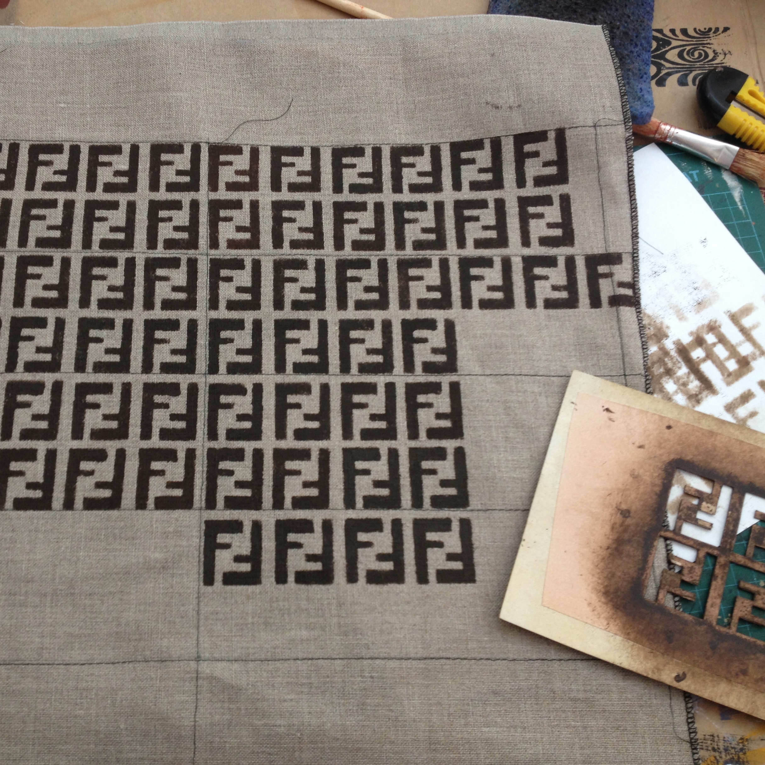
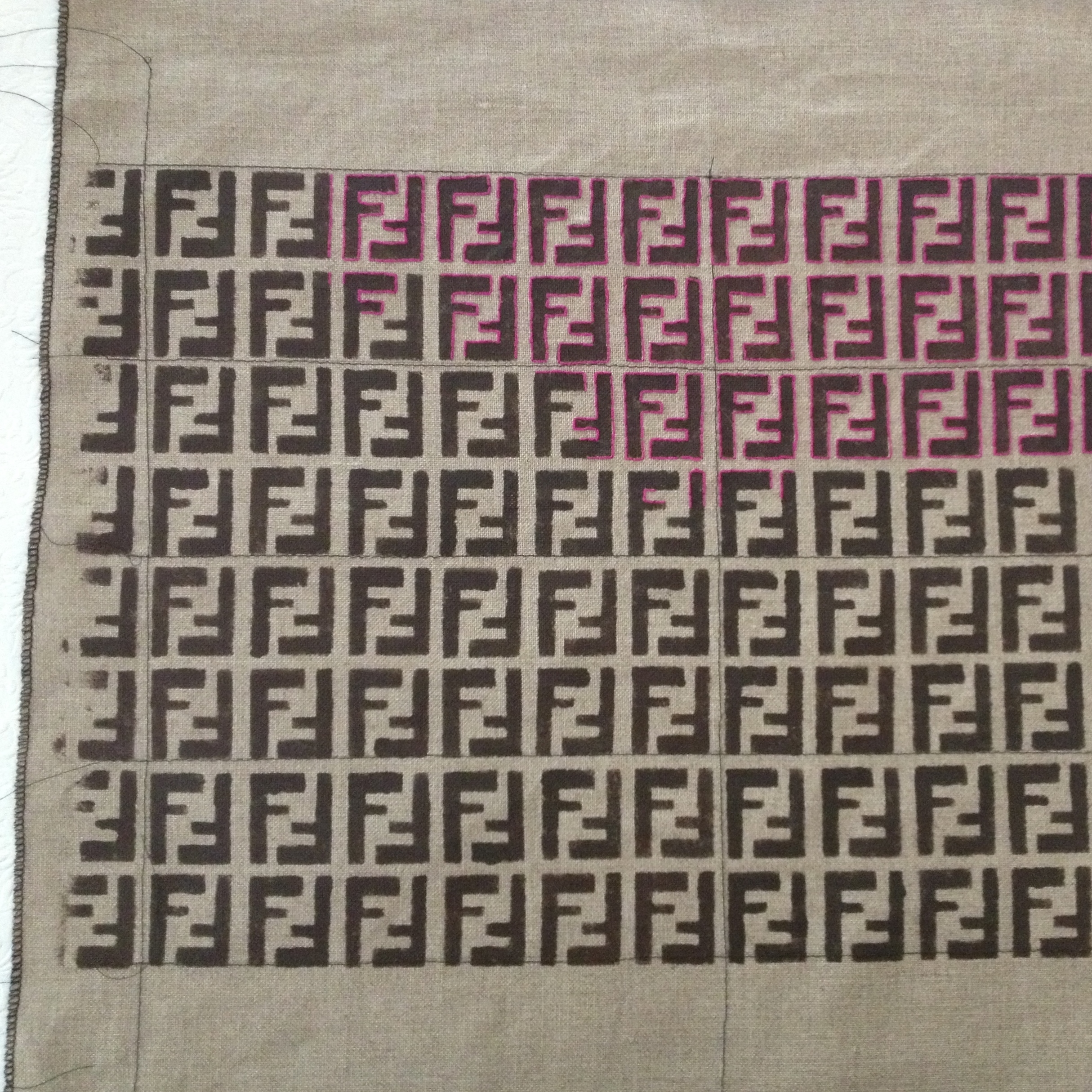
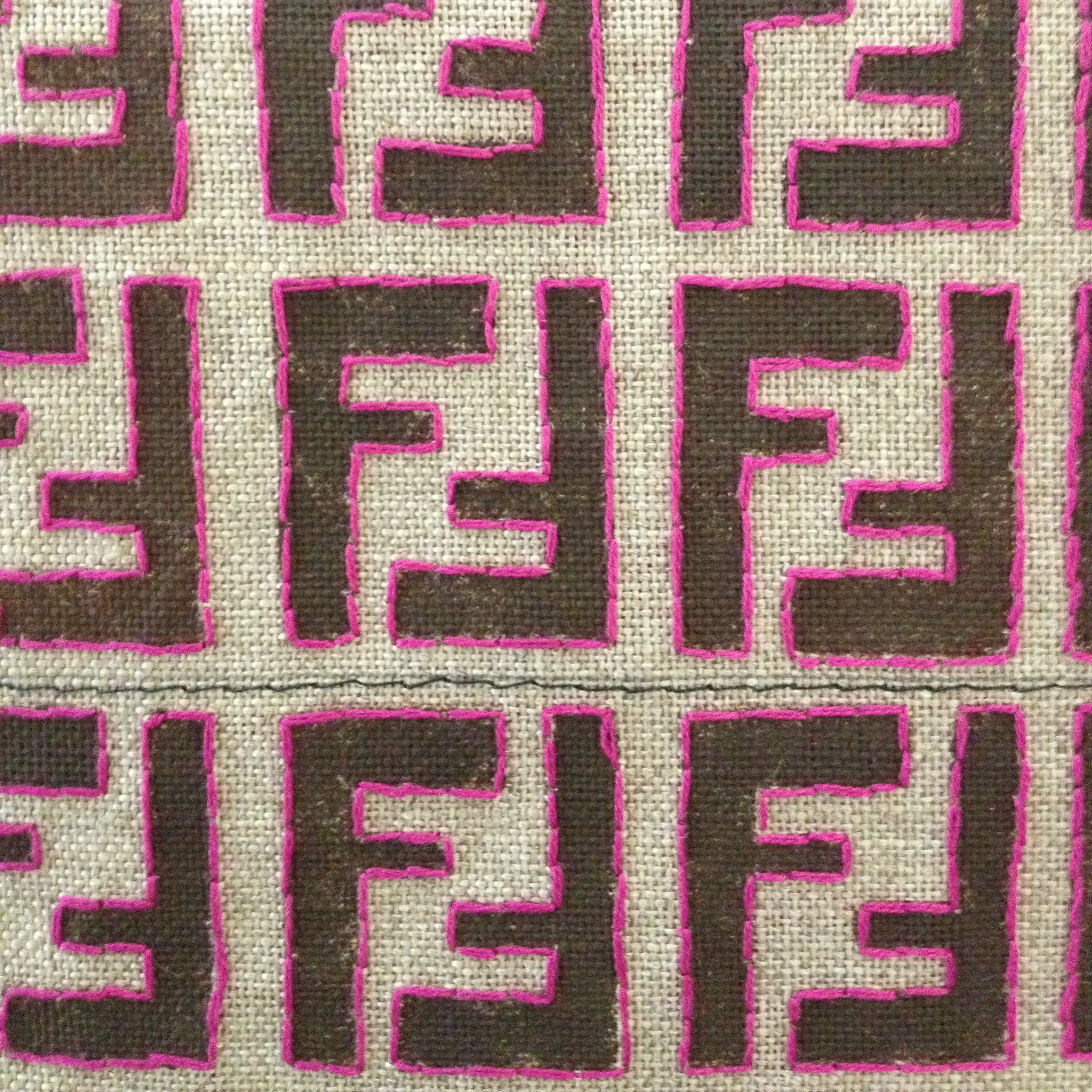
Belgian linen with painted stencil pattern, outlined with hot pink embroidery thread.
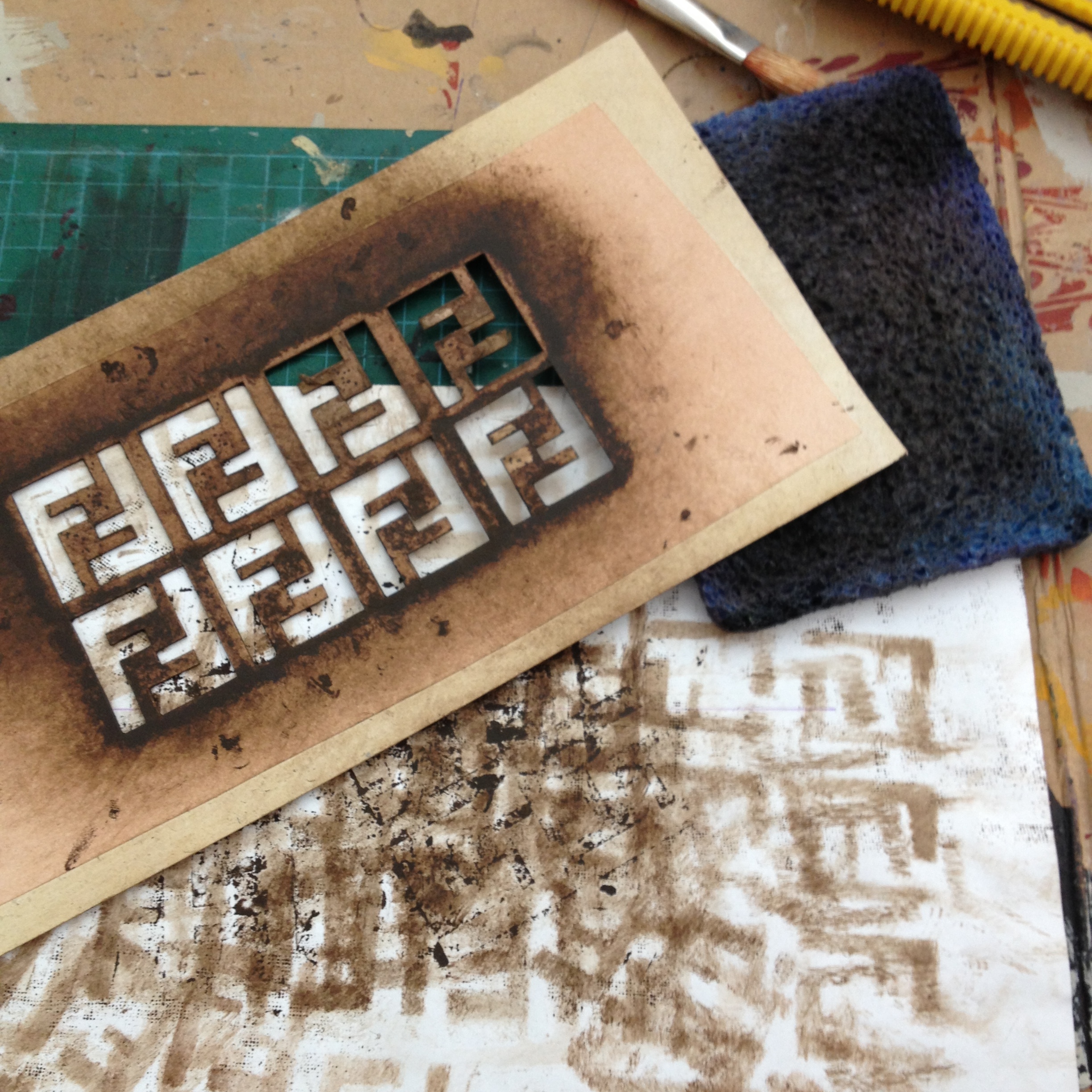
Making the stencil pattern was pretty easy. (I even have a genuine version of the logo in question and lets face it, this logo is well known as is the font itself.) Once the first "F" is done, just copy & paste, say, 3 or 4 sets of letters and print out on ordinary printer paper. Spray adhesive this to a decent weight card and get to work with a scalpel. Much painful cutting here. Artworkers self heal too, eventually, but please be careful! Use a self-healing mat for working on. (These mats are incredibly handy and may save you some trouble. I use them all the time, just as a work surface.)
For stencil making, I used to use a brown, waxed card, specifically manufactured for stencils, but haven't seen this around locally for a long time. Sydney artworkers, we all mourn the closing of Oxford Art Supplies.
But good card, given plenty of coats of shellac after cutting does the job too, just not as cleanly. But as I don't want a factory-clean look on a clearly handmade (I hope) accessory such as this, that's fine. Orange shellac flakes are available at hardware stores or artist's suppliers. Dissolve flakes in methylated spirits but only mix as small a quantity as you think you'll use in immediate future, it doesn't keep well. You want a nice strong mix; the easiest way to explain this is mix it to a nice dark slightly thick dark yellow. Got that? Four or five coats should seal the card from absorbing the water based paint, but be sure to wipe it clean-ish after every print to keep it good. In many, perhaps too many, ways I am antediluvian in my methods. Shellac IS old fashioned, but it's not broken. I always always have some around, it's invaluable in a studio and always handy. But I suppose one could use a spray varnish to seal the stencil, humpf. Just be careful not to use a water-based one; the water content will swell the paper fibers, so stick with turps/meths/acetone type varnishes.
For the fabric itself, I was lucky to find a pre-cut square of very nice weight 50 x 50 cm linen in exactly the right buff colour, good & inexpensive too. I machine overlocked (serged) the edges to prevent fraying and machine sewed on a rough registration grid to more or less line up the pattern. A long, straight stitch and contrasting thread colour on these lines will make it easy to unpick when all is done.
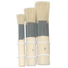
For paint, a mix of burnt and raw umber artist's acrylic was fine, pounced on with a stiff bristled brush. Purpose made stencil brushes are available, but a good number 10 or 12 round hogs bristle will do fine, just hold it down close to the ferrule. Stenciling works best if the paint is blotted off the brush tips; you don't want a really loaded brush worth of paint. Pounce it up & down directly at 90 degrees to the table, this will lessen the chance of paint colour bleeding. There'd be loads of tutorials available in web-land I'm sure, if one needs pointers.
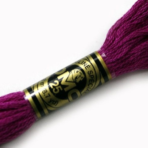
Once the pattern was all painted on and dried, time for the old needle 'n thread! Mmmm, settle down and hand stitch time, nice, I like this pastime. And it's not complicated but I'll have you know that a simple backstitch is a beautiful thing. The amazing embroiderer's embroiderer, Mary Corbet, is an incredible reference point for all things embroidery, and more, if you're interested. Her site, needlenthread.com is well worth a visit. For this project, I reckon that dark pink looks mmmm! with browns and I used DMC #718 embroidery thread, then carried on running an outline all around every little F ....and repeat. Jeez.
For the sewing, I WAS thinking I'd base my bag on this lovely, easy to follow tote bag tutorial from danamadeit. Totes are absolutely the easiest bags to make. With a fabric this occupied, a simple shape will be best. But I'll make mine a little less square I think, maybe and different handles and...it'll be loosely based on this pattern only, probably really..
But no, I rethink this. For a start, I really cant bring myself to set up & embroider another piece, so design decision made, this item will feature one side of the "rosiefendi" pattern only. Phew! That's a load offa my mind bro.
And yes, we say goodbye to this:
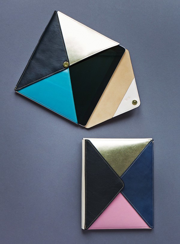
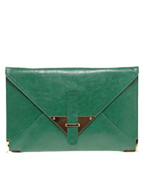
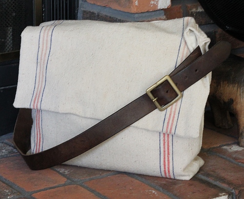
And hello to the possibilities:
(Of which, yes there is still the old tote. But more of a mixed up one.)
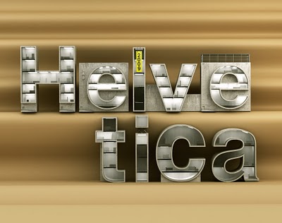
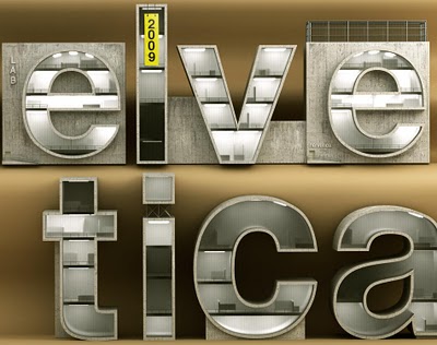
And check this out, Helvetica Hotel! Fictional hotel, beautiful and yes I'd stay there! By Albert Son.
