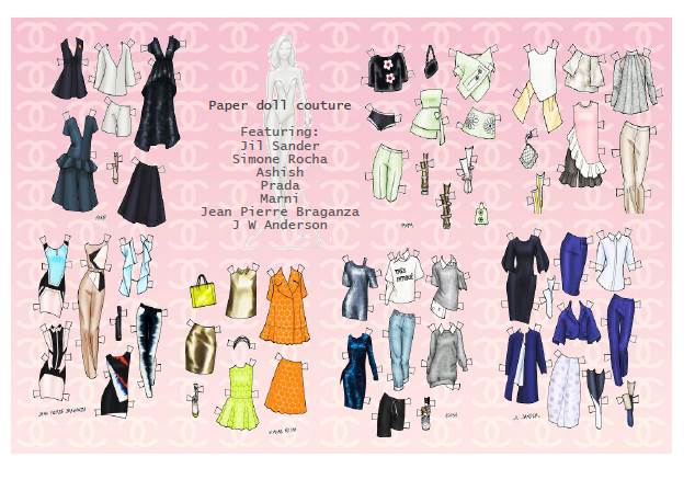
Last post showed making the paper doll presentation folders. Now, onto furnishing them with the cool gear within...
For my paper dolls, I wanted to display ALL the clothes in their collections, but without making book like leaves within the covers; that'd be like having a book then rather than a more simple, stylish folder. So I decided that they would all be tucked in together in pockets. They could have been displayed separately (perhaps in clear envelopes?), but that'd be making a different object and not the folder concept. With room for 2 envelope-style pockets to fit vertically, opposite the doll, I spaced them so the lowest one would contain the longer garments like dresses and pants.
But I needed just the right looking envelope-pockets and thought "Yay! Time for Officeworks!" And there I found them, of course. That place has everything!
These window cards are perfect, like, just the right creamy white and with an embossed quilted effect, very much in the style of the well-known-fashion-brand on which the style scheme is based! All they required was carefully gluing a concertina hinge at the sides, to allow for filling with clothes, and a small rectangle of clear acetate for the window.
Cutting out all the clothes for two dolls was a labour of love though and this is something one is prepared to do for best friends. But these pockets worked out really well, I think they look great. It was nice knowing that everything had a lovely wardrobe to live in and that everything was taken care of, nicely.
Now, the paper doll is printed to A3 size on decent printer paper, but still needed stiffening by fixing to stiff card via spray adhesive before cutting out. I decided to leave the between-the-leg area as solid, to cover another thin strip of Balsa wood glued to the back to make sure she's really stand up straight. She is attached via small adhesive Velcro dots to the inside left of the opened folder. This way, she can be easily and neatly stored safely when not out for a play!
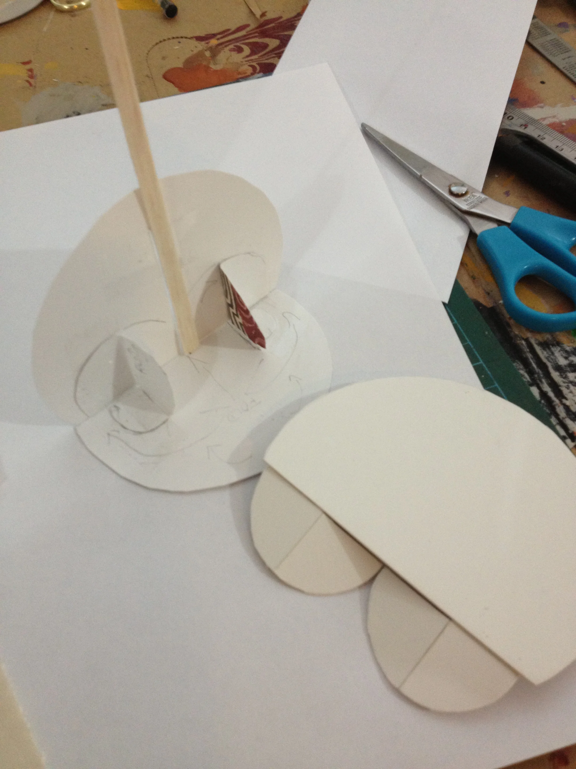
For making the stand my way, see this tutorial for details.
Going with a semi circle motif, the stand folds flat for storage inside the folder.
I wanted to also include some explanation/instruction inserts within the folders; a few words about how to set up the stand and an index of the wardrobe collection, so it could all be seen in it's glorious entirety. And I wanted to make a gift card too. I found some very cool images to work with:
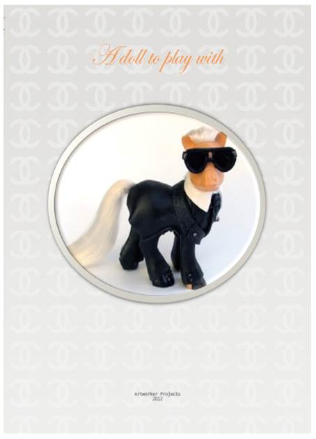
The amazing Mari Kasurinen creates customised My Little Ponies that are staggering in their mastery of technique. I came across *the above image through one of AnOther Magazine's newsletter emails. This piece is titled "My Little Karl Largerfeld" and as such is the perfect image for my gift card covers. I love it soooo much. See it here.
*This image also went on to inspire another artworkerproject: the My Little Pony Project! Have a look!
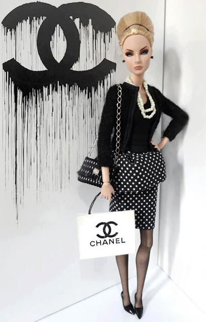
The "Chanel Barbie" I stumbled across when Googling...yup, "Chanel Barbie", and tracked it back as far as this link but cant find the original source. Please do let me know who's responsible for this gorgeous thing if you've any idea. This image became the cover for an index card, showing the whole collection of designer clothing available in this present.
The finished card, inside & out, along with the instructive insert, below:
And there you have it kids. Two lovely presents for two lovely friends.
Project complete. Tah dah!
And that brings us to the end of this project, wasn't it pretty?!
Be sure to check out Danielle Meder's paper dolls at finalfashion.ca and Mari Kasurinen's work too. They're great.
