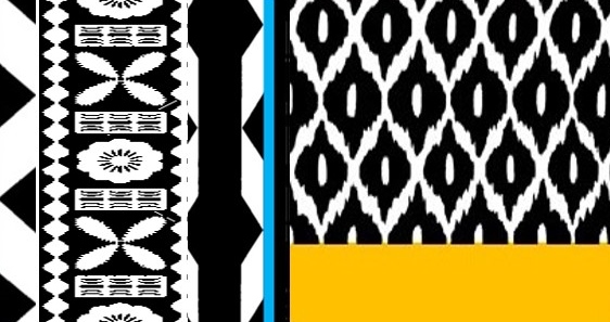
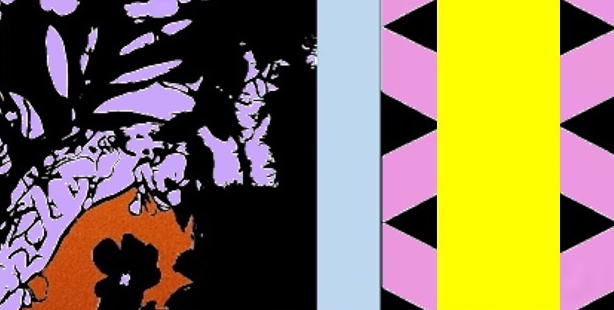
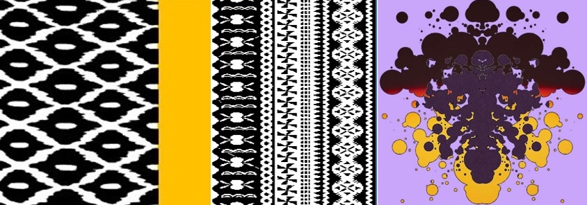
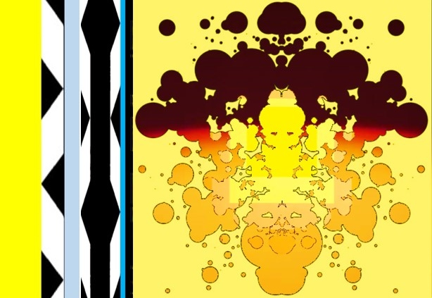
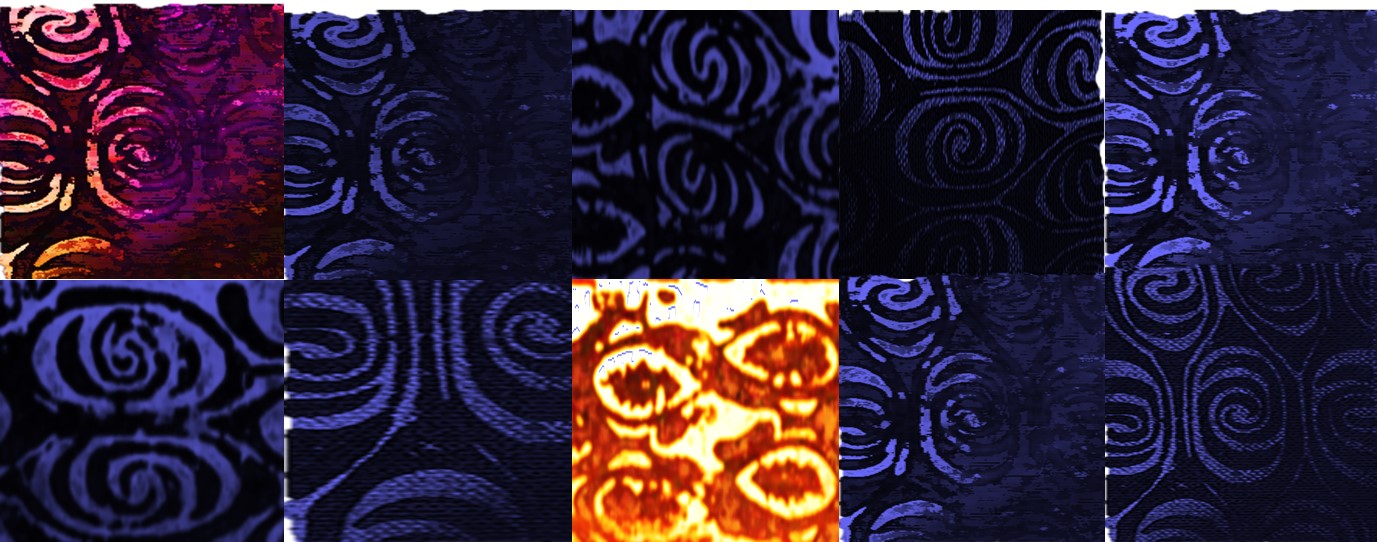
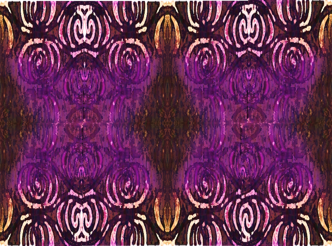
I recently submitted a proposal for "Colourful Decorative Abstract Panels", to suit a specific client brief. The commission would involve producing several large-ish panels for the public areas of a new residential development in Sydney. Above & below are a few from this recent crop which I quite like:
I made a helluvalot of compositions for this submission, as is my way. Shuffling around images, colours, patterns & textures from my personal archive is a favourite exercise but I have this art dysmorphia thing. Its like body dysmorphia, whereby one regards oneself unrealistically: I do this with pictures I make. I think they're all freakin brilliant. Fantastic, at the time of making. Then sometimes (often) I catch glimpse of a composition that I only 30 minutes previously had thought to be freakin brilliant, and it's actually bloody awful. But I have such trouble letting any of them go, I'm dreadful at critical editing. I'm freakin TERRIBLE at self editing. Sometimes to my horror, I'll shudder to see a piece of mine which rightly should've been binned, still kicking around years later and embarrassing me. But sometimes, I'll see a past work and be truly surprised...that I find it good.
The designs for this last lot are along a similar vein to another commission I undertook for a project in Port Moresby, Papua New Guinea, two years ago. This was also for abstract, decorative, patterned panels/canvases, comprising all artwork within two new build hotels. As Papua New Guinea is one of the beloved locations of my early childhood, this commission was a pretty big deal to me. And I'm still mostly pleased with the work, thank heavens. Phew.
The development of these works was lengthy & the path to final installation was long, but it was so good. I loved this job. The following are some images made in this process that I still like. Believe me, there are a feck of a lot in the bin.
From my proposal submission:
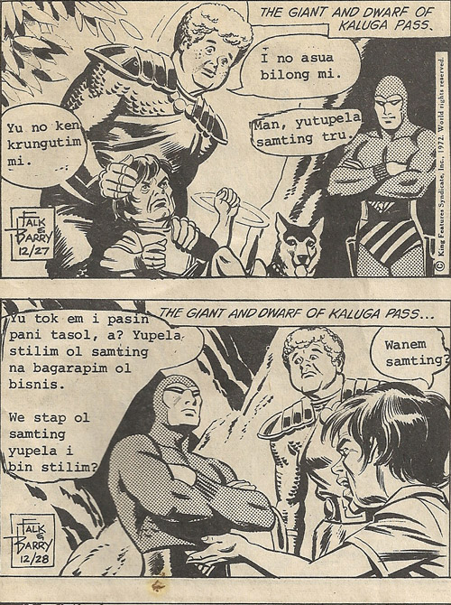
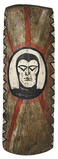
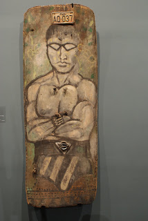
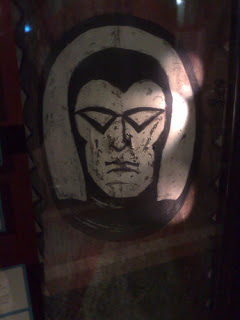
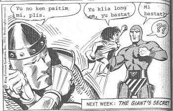
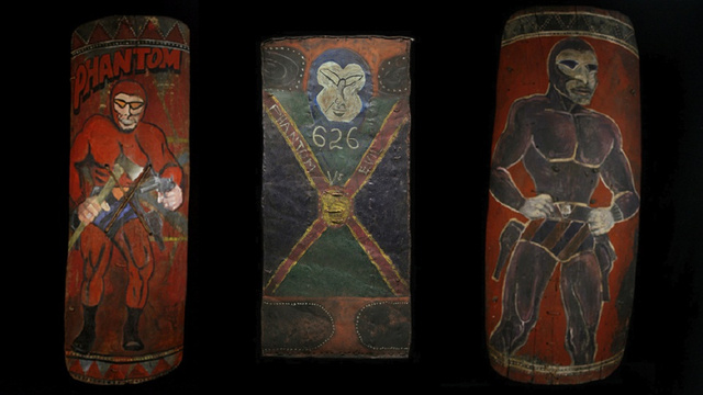
“In 2007 in reviewing the tribal Art Fair in NYC, critic and historian N.F. Karling penned the term “Pop Tribal”* to reference the work by PNG artists who used traditional tribal artist’s methods with modern Phantom comic imagery. [I] propose a creative and contemporary interpretation of this term to suit the interior design of the two properties as well as referencing PNG culture.”
*Read the artnet Magazine Pop Tribal article here.
Studio. All done & on way to photographer for digital work.
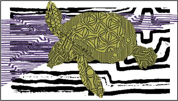
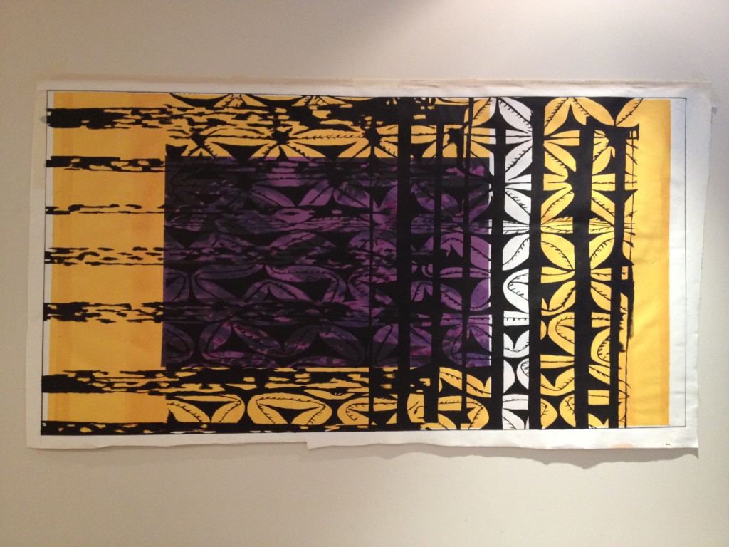
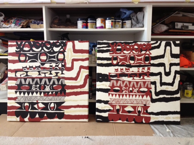
The particular images above & following were amongst those commissioned. The original designs were translated to 1:1 scale paintings which were then produced as limited edition prints on canvas. On these four, I really like how the white border is a fundamental part of the composition, I like the layers. And that golden yellow is so...golden yellow. Each panel has the same base colour but is varied with layers of darker/lighter bands and all the black line work is deliberately 'hand painted' in nature, but cleanly so. It's a cracker colour combo & quite striking. IMO.
Framed prints on canvas ready for installation on site.
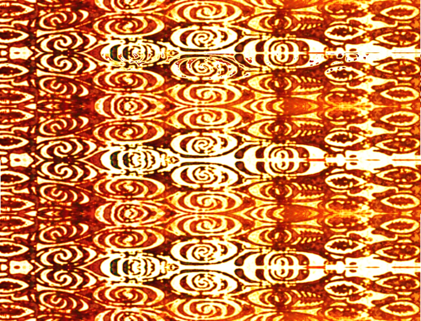
Then came abstracted faces, showcasing the emblematic painted body decoration, of course. Too stunning not to include. Went very pop with these, impossible not to.
Two versions of these were selected for limited editions.
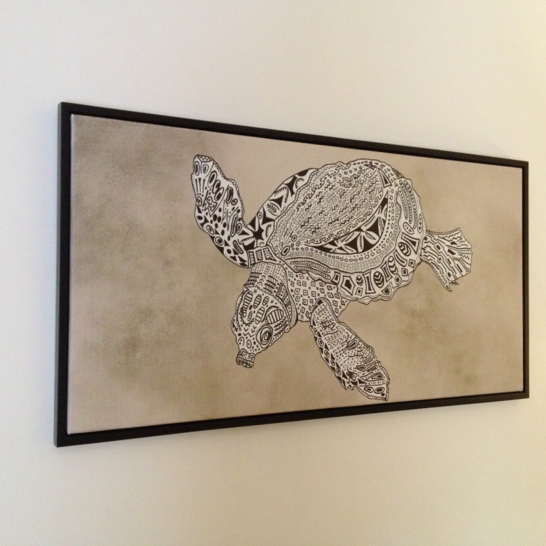
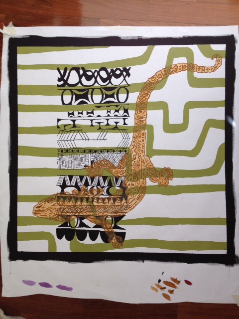
I was also keen to include some cool animals which are native to Papua New Guinea:
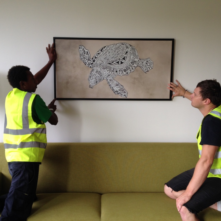
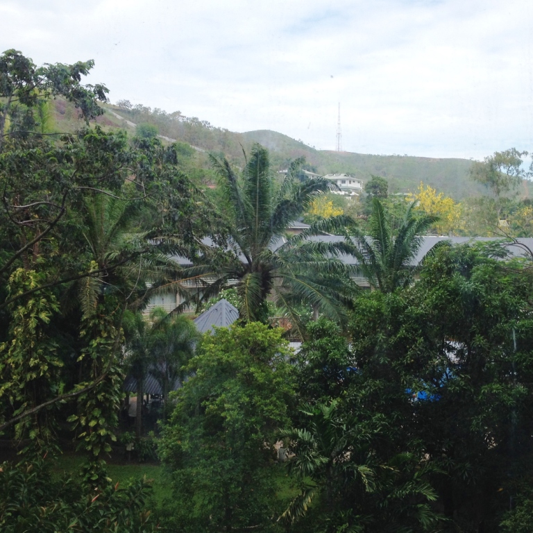
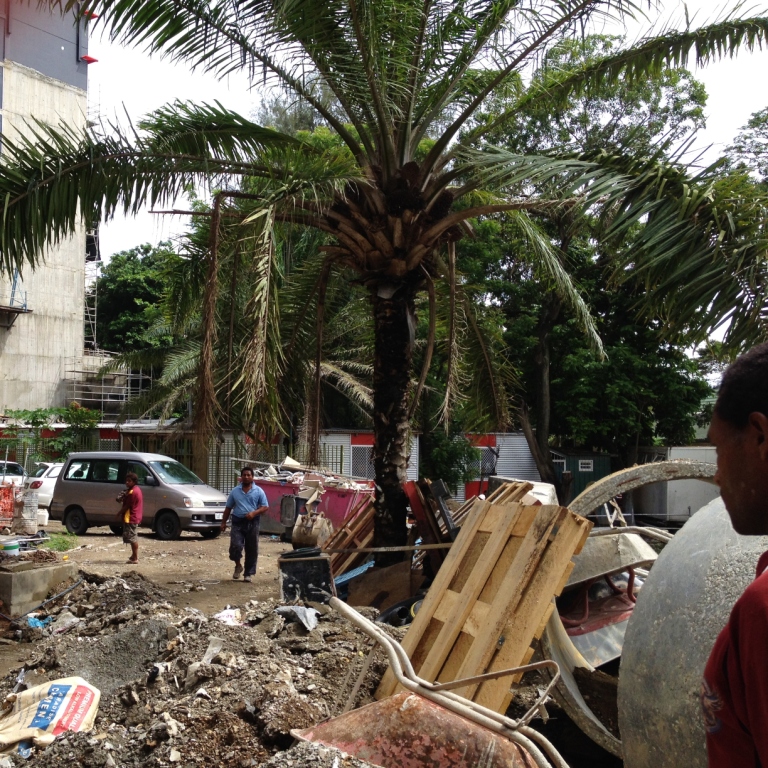
Onsite, Port Moresby. I love this photo.
And some more more more. Loads of false starts and detours and re-hashes but I loved them all really. Dysmorphic, I told you. Lucky I wasn't making the final selection although there were a host of critics in the Project Control Group. Or so I'm told.
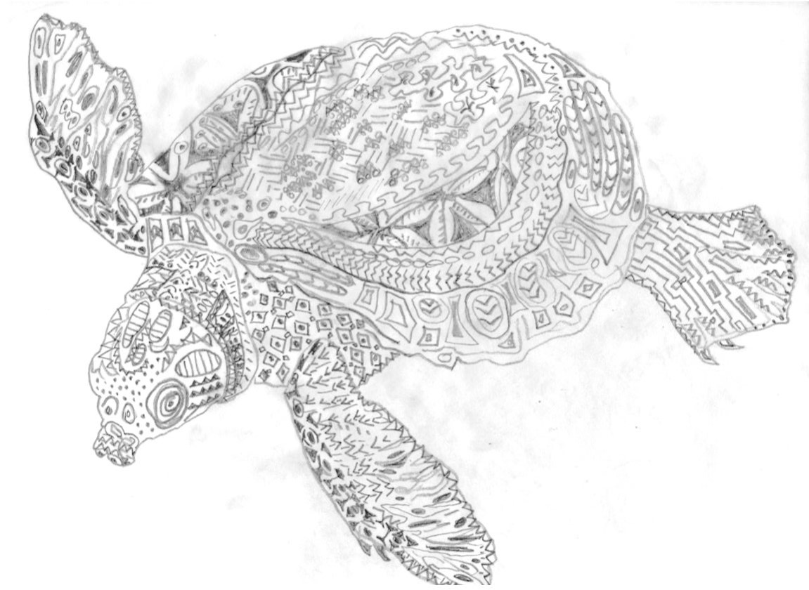
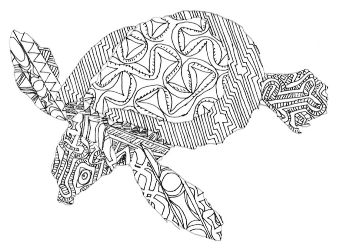
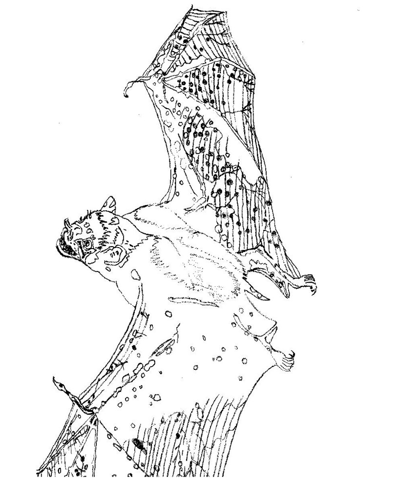
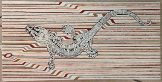
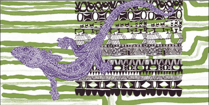
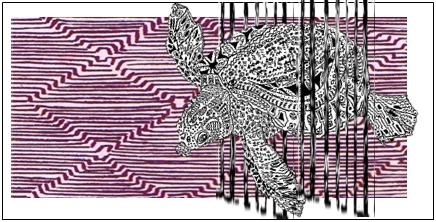
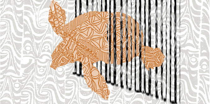
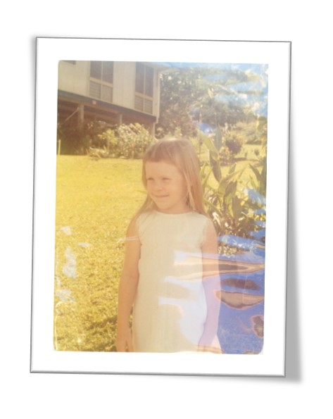
My PNG job. I loved doing this project, but going back to Port Moresby as a grown-up made me unbearably sad. It was so beautiful in my childhood and its still beautiful, but it felt neglected and sad. In a society comprised of numerous autonomous tribes in frequently dangerous, often impassable terrain, politics are complicated and natural resources are in demand - for use everywhere else in the world except for PNG itself it would seem. I ventured out into the streets alone on a few occasions (the work site was fully fenced and guarded, but outside those gates it was game on) and it did feel scary but I also visited my childhood home and school which was overwhelmingly emotional! Tears! I could say a lot more about Moresby & my family, but not now. It's still too soon & I can't seem to make it come out right. Just that to me, it was really sad. I make no attempt to address this, with these paintings, but I wanted to do something good. So I made a lot of pictures. It's pictures and me and all that time, from then to now.
Landing this new 'abstract decorative panels' commission is looking extremely unlikely, but I do like a few of the designs that have cropped up and its been interesting (to me) to pass over the PNG ones again. I'm toying with idea of going ahead and making some of the new designs anyway, fer reals. Lovely big glossy panels, be so good! Double glossy, look so great! At least that's what I'm thinking now...But I'm bound to be horrified by them in the near to distant future. Or not.
I do like me an abstract decorative panel.
