
...at the Art Shop!
This is a celebratory post!
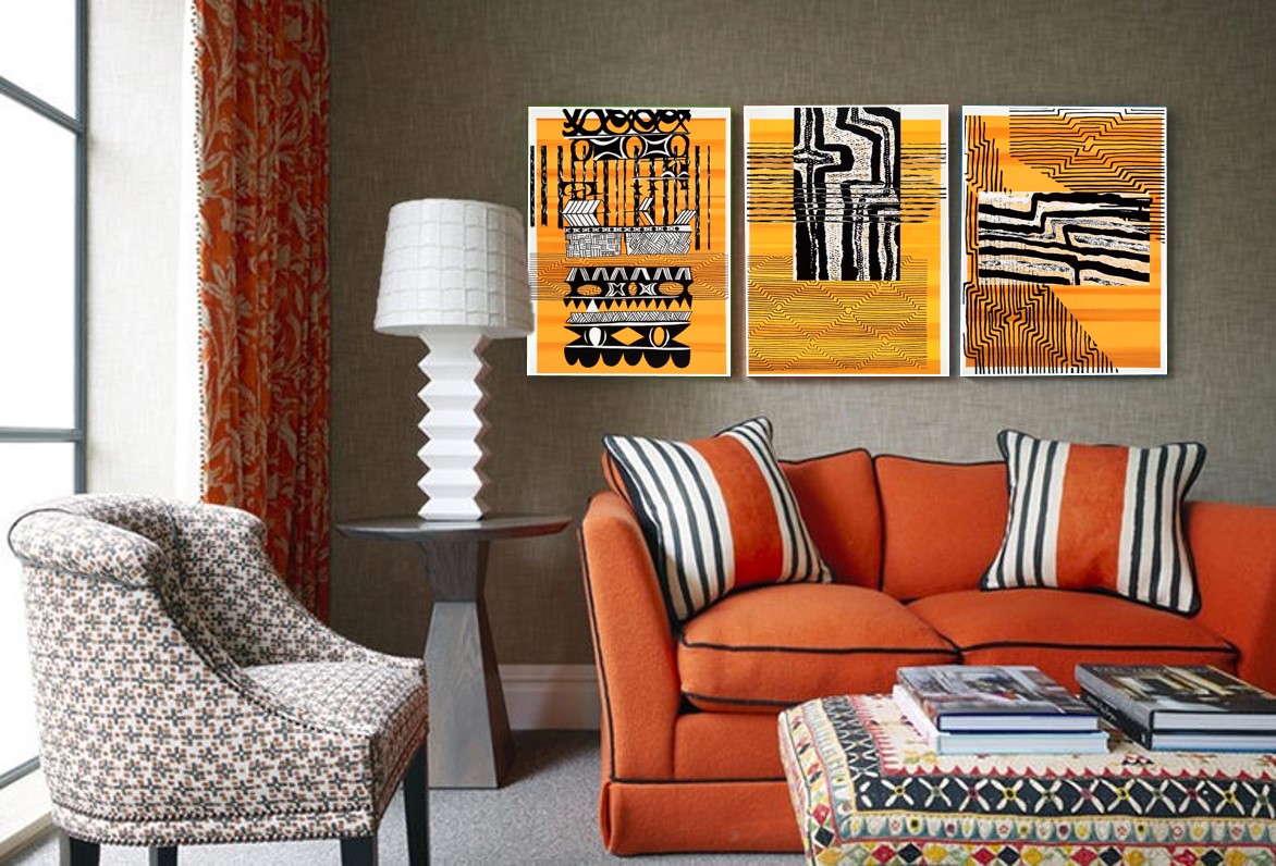
Yo, art fans, in response to many requests, selected artworks from a recent commission are now for sale to the public as limited edition prints on canvas & paper! The "Pop tribal PNG" artworks were conceived as commercial prints and are therefor available at low cost in both standard and custom dimensions; affordable art! Everyone needs some of that I tell you and these pieces are...I would characterise them as: graphic, bold, decorative & vibrant. Strong and unique statement pieces. A jolly good dose of TRIBAL POP.
As I mentioned here, these paintings were commissioned as public area and room art for a resort in the South Pacific. There are eight pieces in the collection; four were designed as large vertical pieces for lobbies, and two pairs of artworks were created for room art, known ceremoniously as "Above Sofa" (larger) and "At TV" (smaller). Poetry really, poetry.
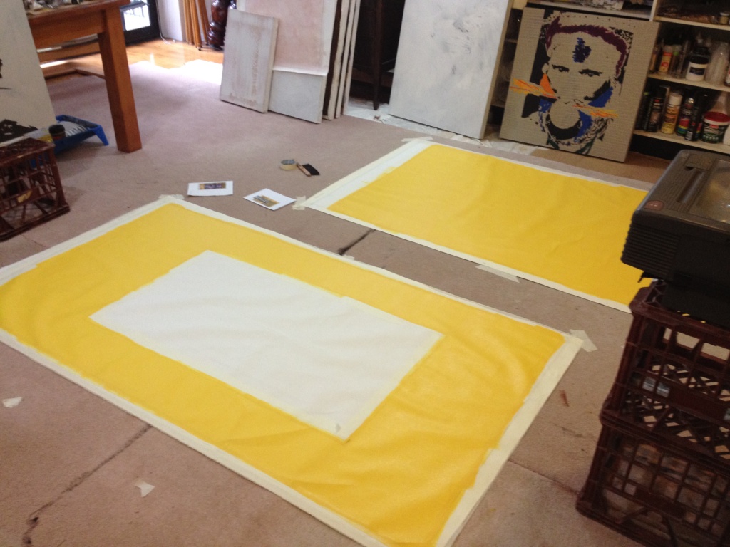
All are available at either the dimensions I've preset, which keep the aspect ratio true to the original proportions, OR at custom sizes; so you can have them at any dimension you need forgoodnesssake! Bespoke arting, woof! These pictures really lend themselves to custom sizing, being essentially all about patterns, strong colour & contrasts.
So yes, these are 'hotel art'; have you ever wondered about who does the art at any hotel you've ever stayed in? Well it's people like me. There is a whole artistic sub-culture around hospitality artwork & as the work is scrutinized at very close quarters before it even hits the wall of your room, making it can be a very protracted business indeed. I've been fortunate to work in this industry for lots of years but this is the biggest commission I've ever been associated with. And it was fantastic. It took almost two years from my initial concept submission to seeing the art on the walls and I still think its the best job ever. Thats pretty rare btw, liking it still; often the final result has been so compromised by approximately 8000 people's contradictory opinions & multiple budget cuts that one can feel rather flat by the time the finish line is in sight, if not well before. But this one has a lot of me in it and I was well supported by the design/construction team as well, also rare. I like them a lot. Still!
To kick off the initial Art Shop offerings of some (yes, there are others not shown/offered here) of the "Pop Tribal" artworks, I'd like to do a bit of a roundup, a brief history of the commission & insight into the creative process as it progressed through the making of the project. Those pictures dont make themselves you know; I do!
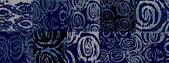
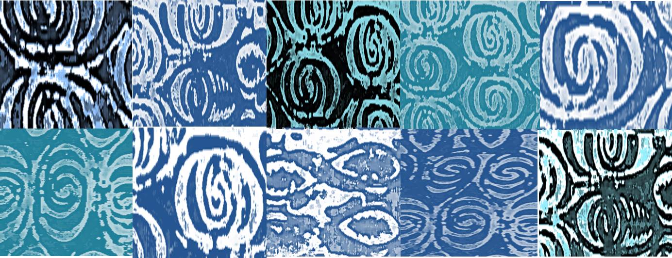
So. Art for hotels in PNG. From the beginning, as soon as I heard about this project, I thought "patterns". I grew up surrounded by South Pacific/South East Asian decorative art which is not a surprising or unique experience, given that decorating almost every available surface with pattern - from line work to stylised figuration - is a really noticeable feature in these parts of the world. Decorative patterns are everywhere, on everything that can be painted, drawn on, carved into or burned onto, its like a shared subliminal cognitive tattoo, its just 'in' and 'on' everything. Its certainly in my head, I've been in the thrall of surface decoration all my life I think, and I found the creative work on this project just flowed. One of the many reference books on 'tribal patterning' I found in my mother's library, described the urge to decorate beautifully:
““Generally, a decorated piece of personal equipment is preferred to one in it’s plain state because grass-roots art pleases the eye, regales the mind and reminds the owner of his traditional concepts and way of life””
In the beginning...
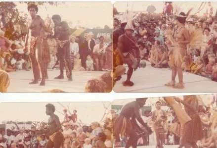
Regales the mind, I love that! In my research I contacted a lot of people, family & friends who had some knowledge & experience of life in PNG as an outsider. If one assumes visitors (to the resorts & hotels) want the 'local' aesthetic experience channeled through artwork at their accommodation, then I had background & resources on tap. People who had spent some real time in the place but who always remained 'outside'; just as current day guests would. I rounded up & pored over family albums & old books full of detail and sifted through loads of images both real, remembered (not the same thing) & imagined. I developed the artwork direction & 'feel' as I went and started putting patterns & colours together according to the 'usage areas'. ('Above sofa', 'at TV' etc.)The interior design sample boards showed an overall aesthetic and the feel was definitely contemporary, clean, evocative of the location and quite strong in terms of hue when it came to the artwork & accessories so starting with patterns and colours was pretty natural.
Along the way, the predictable "colorful native costume" was ruled out pretty early on although out it was definitely a valid starting point being so unique and particular to the region, that "South Pacific vibe" if you like. I was concerned about using pictures of nationals in tribal costume given the indigenous peoples of Australia's aversion to images of living persons, so I spent a considerable amount of time researching this, contacting academics at University of PNG as well as other local creatives until I was assured that this wasn't a valid concern. Turns out everybody loves dressing up & taking photos, same as a lot other people in the world, heh.

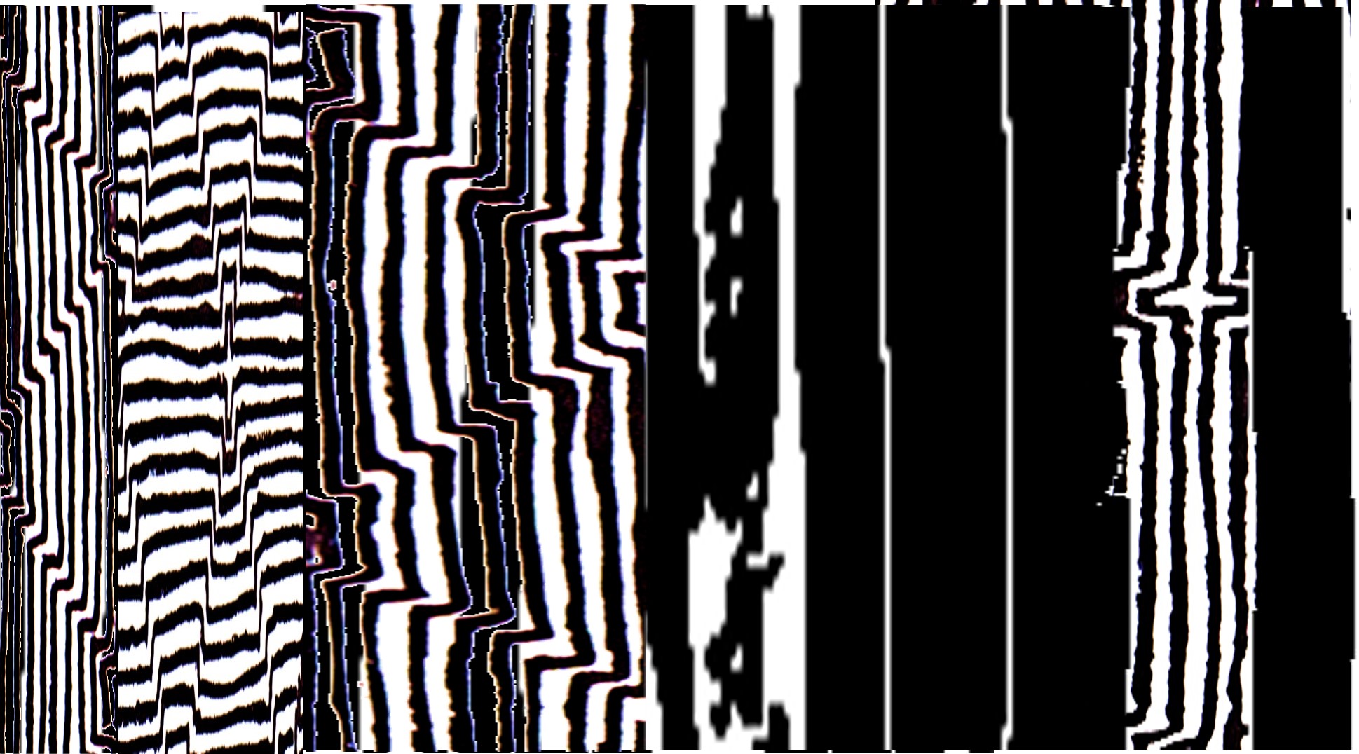
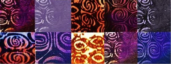
Highly technical colour references, 1,2,3,4.
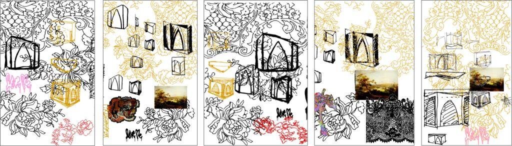
Things started moving once I started collaging patterns around, changing the scaling of repetitive marks and layering things up; the resulting compositions were really striking. We limited the colour palette, keeping it strong & contemporary, ("we" refers to the collaborative nature of hospitality commissions; one is making art to order to a degree & the team I had on this project were really supportive and helpful!) always keeping in mind that this could not get heavy with meaning; these are decorative pieces, for pleasure. Maybe to regale the mind yeah.

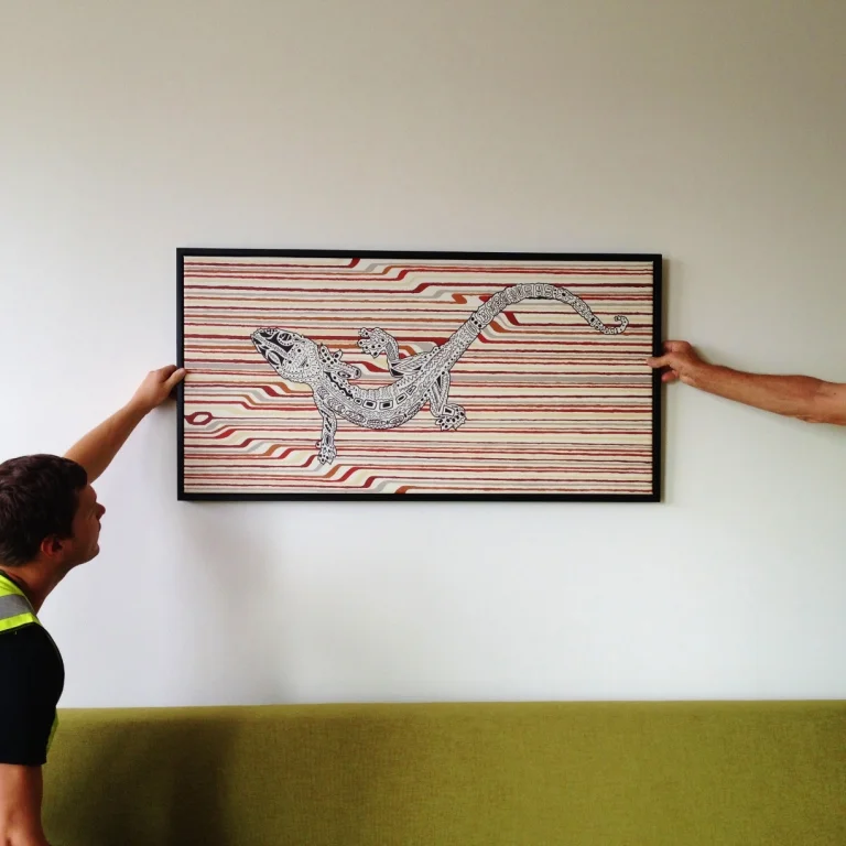
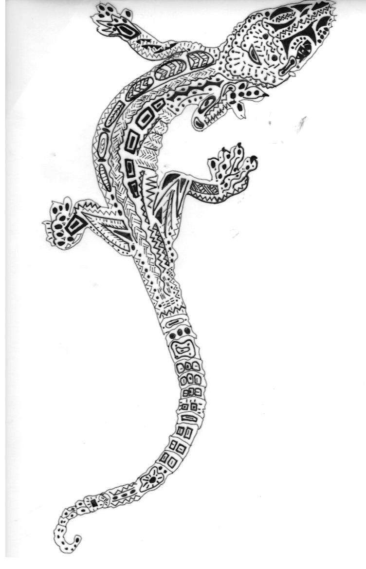
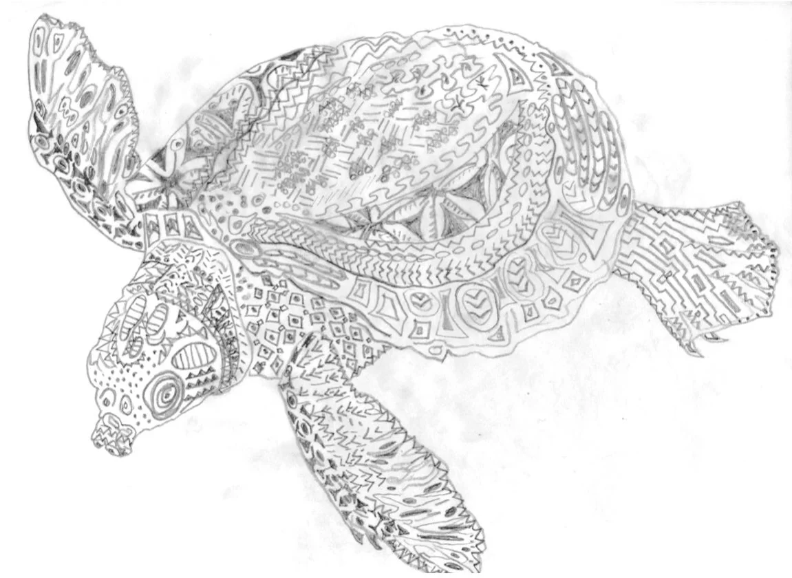
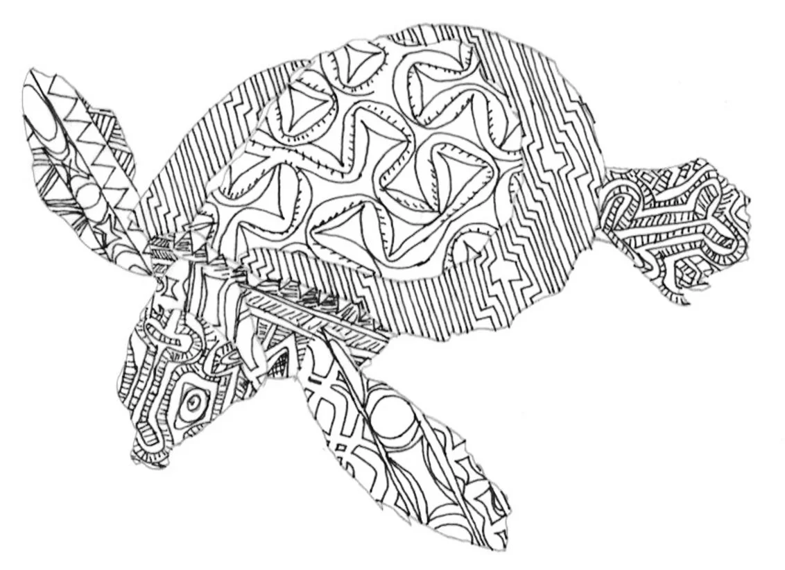
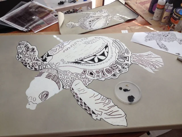
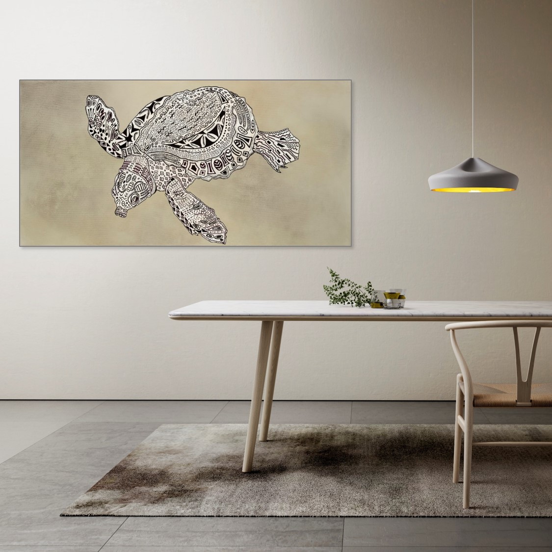
The large pieces would be in public areas so these were the most strikingly abstract whilst room art could be a little more contemplative. I also wanted to employ some figuration, referencing some of the amazing animals native to the region & which are central to the sense of national identity. Besides, such an opportunity to feature something so unique! (Just the nice animals though, which ruled out the fruit bats. As a kid I was terrified of these, they'd cover the sky every afternoon & hang like pouches with fangs from tree branches. Scary bats.) The gecko's I loved, they're see-through with these padded toes, always stuck to the insect screens over the windows, amazing things. The giant sea turtles had to be included, so grand and graceful, they seem to me like the dukes & duchesses of sea-type creatures. I imagine them slow waltzing through the warm pacific waters. As for the much flogged bird of paradise, that was way too predictable & hackneyed, so sorry birdy you no fly this trip.
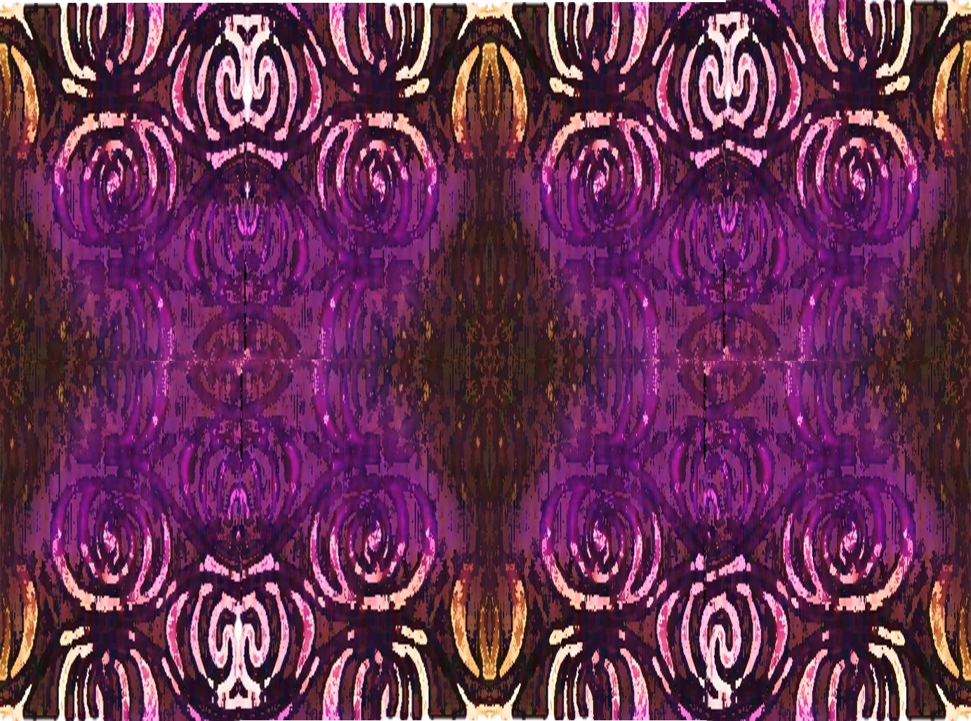
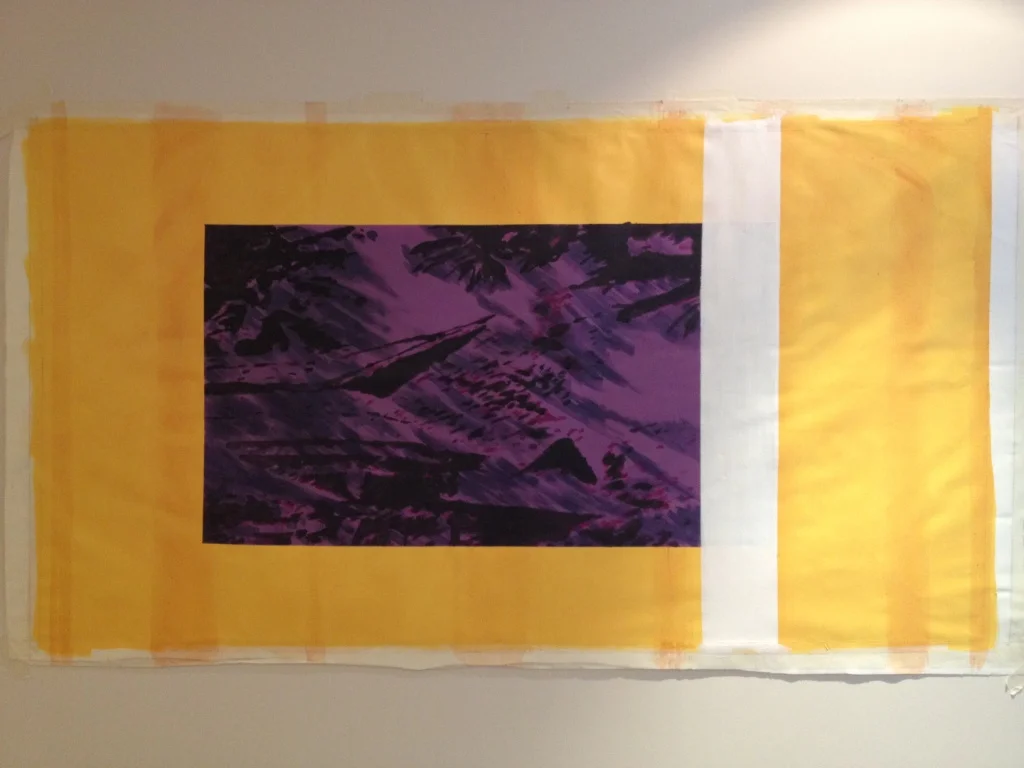
Try as I did, no-one voted for a teeny bit of purple. LOVE the purple.
Having by now decided on decorative hand drawn patterns and the bright sunshiny face paint colours, I refined the brief through making picture after picture on the screen and in the studio and totally enjoying the journey. Yea, the concept was sound but the development took months.
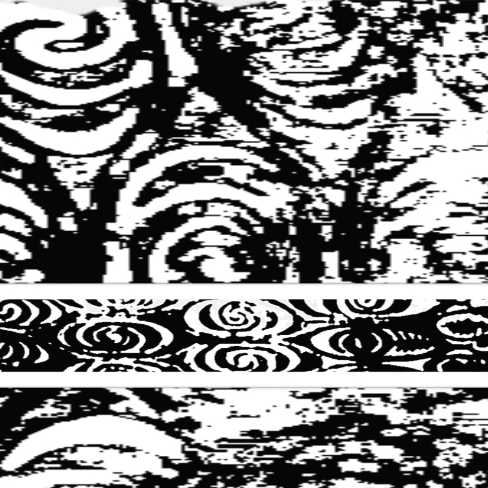
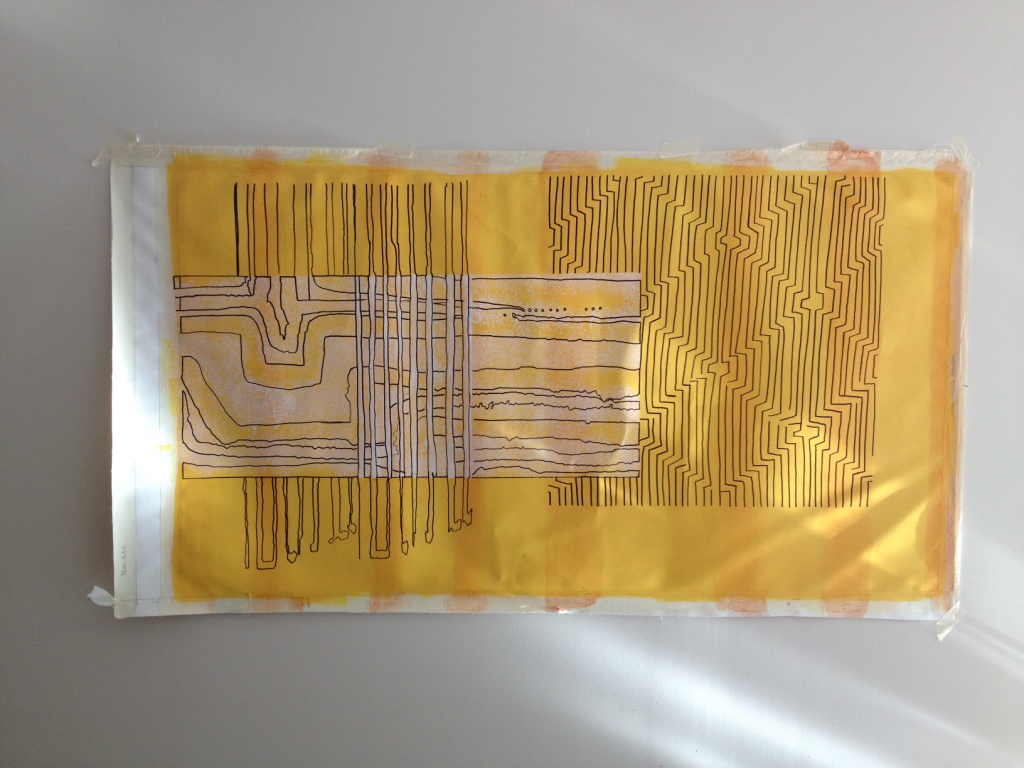
So I copied, pasted, enlarged, segmented, recoloured, doodled, painted & freehanded over & over again.
“In traditional New Guinea patterning, the eye is a central motif. The eyes of people, animals, insects, birds & fish are often the focal point of a design along with seeds, leaves and flowers. Designs may include several motifs, but most have perhaps only one distinguishing feature surrounded by a variety of ‘fillers’. Patterns are most often executed freehand without a previously executed design, where the artist or carver follows a design projected by their own imagination”
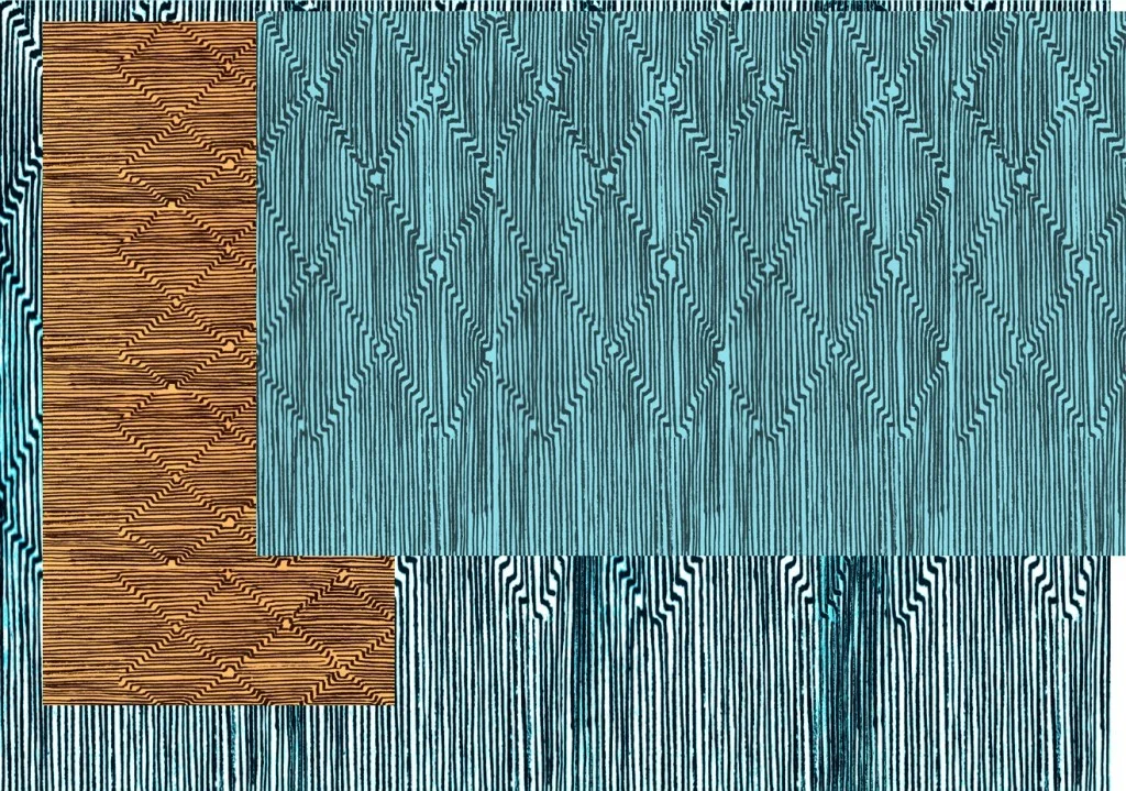
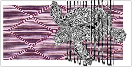
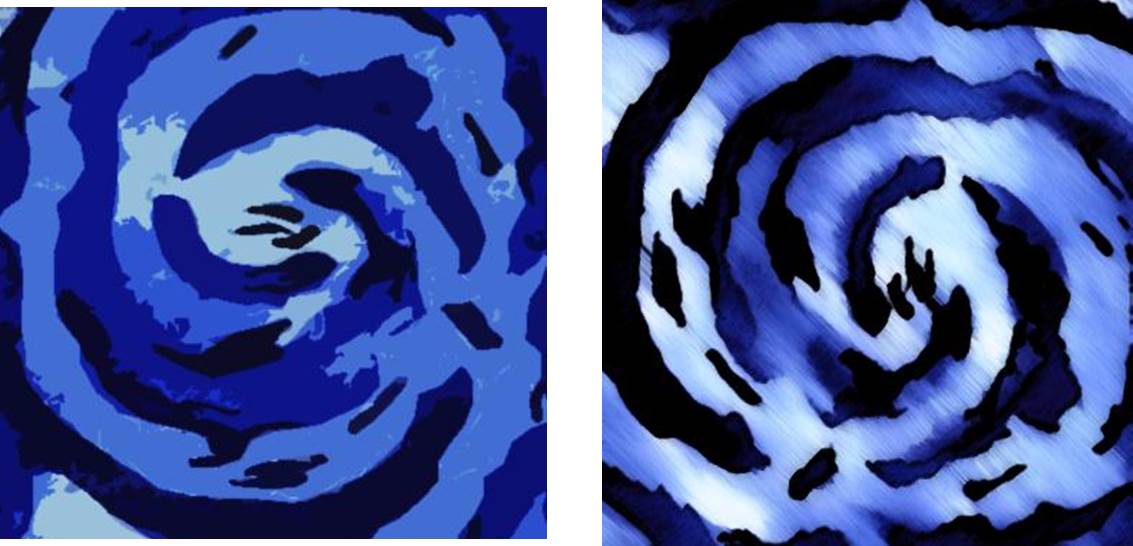
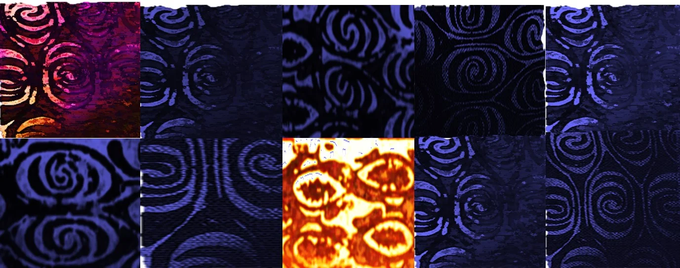
If you ever come across the book quoted above in a second hand book store, get it, its a slim volume but full of the most beautiful drawings collected in North-Eastern New Guinea between 1925 & 1956. A treasure! I adopted the focal motifs/filler patterns approach when decorating the Sea Turtle & Gecko. I sectioned them according to the movement and parts of the creature's bodies, then went on meandering away with lines, curls, dots and solid shapes. It was an incredibly enjoyable bit of drawing. When I collaged some existing patterns across the animal's body, not from my own head/hand, I found this was much less successful. See below.

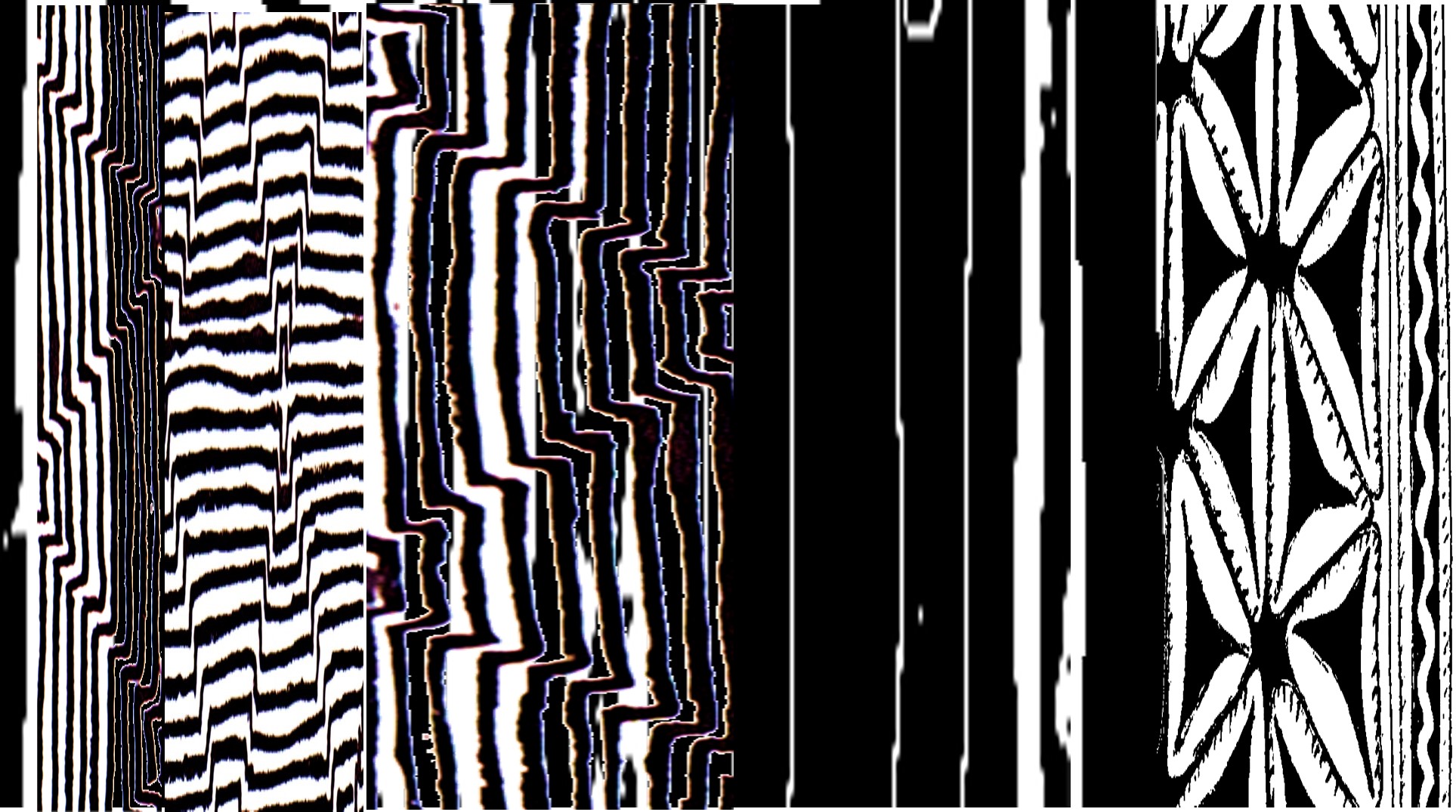
Fun-ing around.
I got a bit off course at times, too many long days in the studio, too many late nights at the computer screen. Somehow I'm thinking swimwear fabric for the above. Hmmm, wtf?
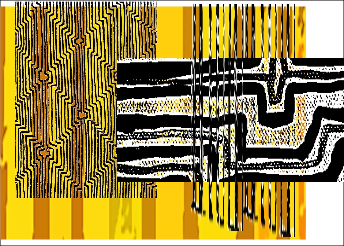
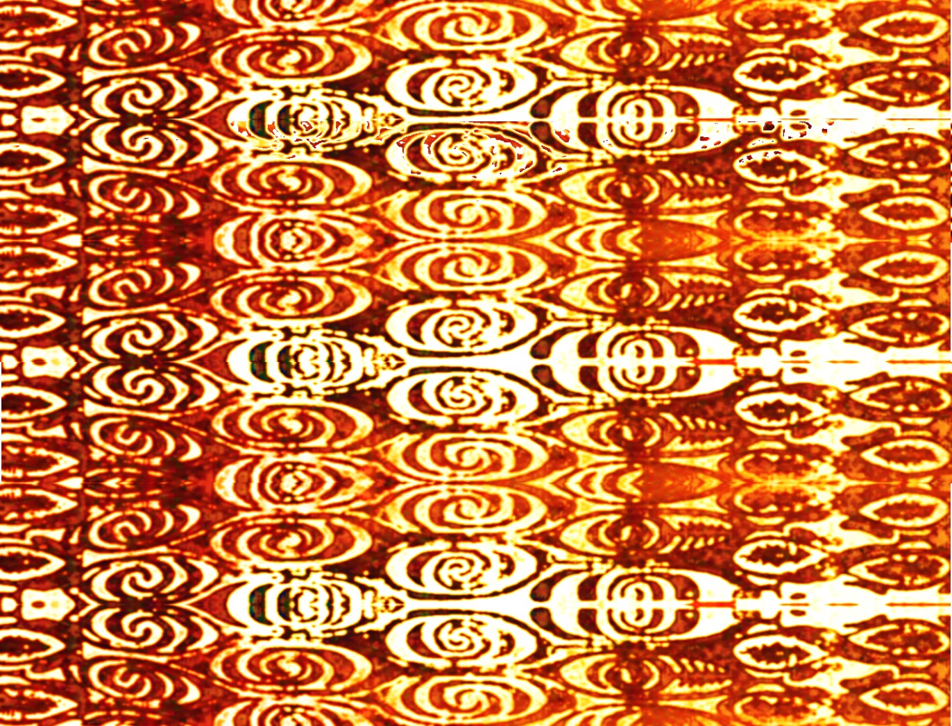
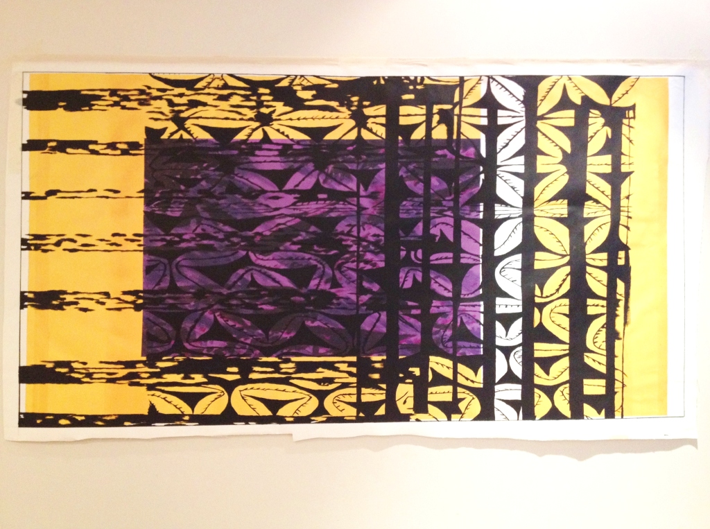
I have since played with further cropping & enlarging certain sections of some images, more abstracted from the abstract. I really like the saturated colours. See below. I plan to work these up more to add something a bit more blithely pop-style in another collection. Stay tuned to Art Shop as I will add more pieces & offer different colourways here & there over time. This is real art fun-ing.
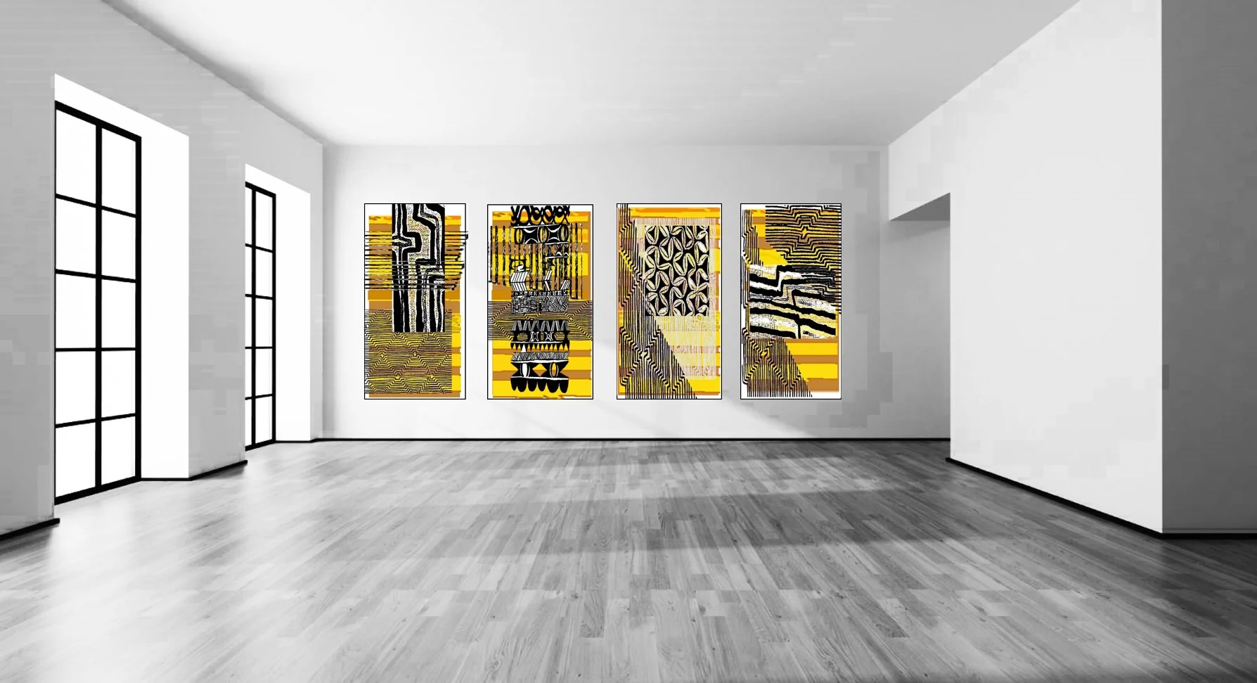
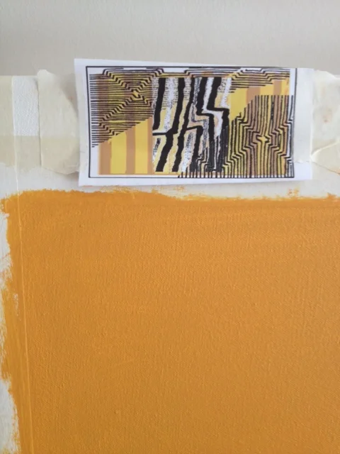
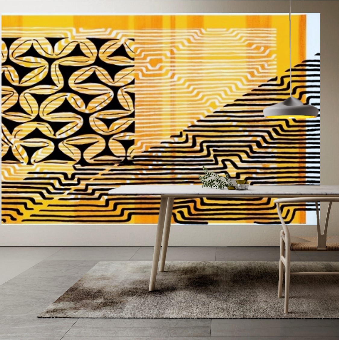
I used a fabulous yellow, bright but rich for the large lobby pieces & this was taken directly from the tribal face painting colours. The most amazing saffrons and crimsons and cobalt blues are contrasted so well against beautiful dark skin colours, and the many decorative jewelry & accessories worn at certain ceremonies & celebrations just POP with vibrancy. It's these hues and contrasts, the exuberant display, that inspires most visitors to the country to take endless photos of folk in national dress. So even if its 'just for tourists', what a significantly unique and attractive aesthetic!

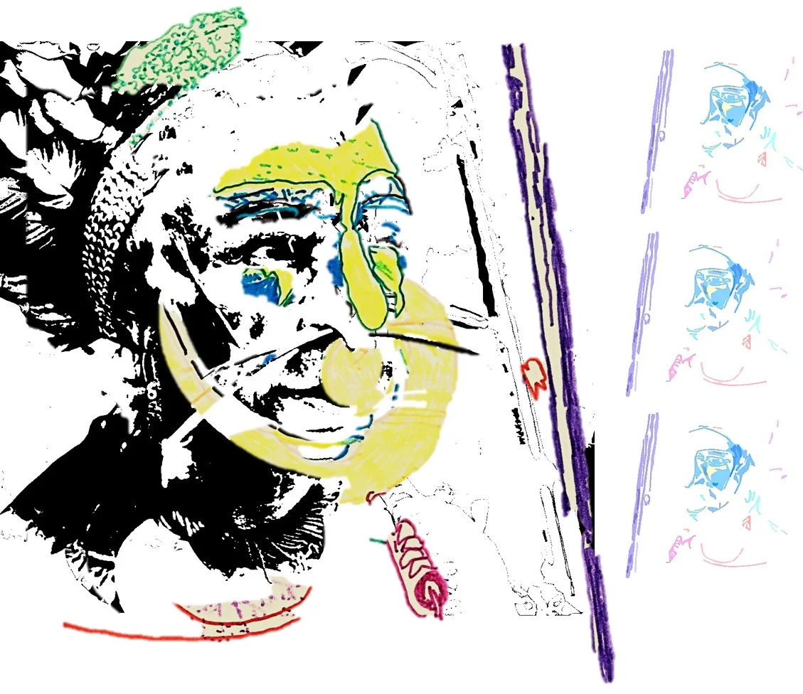


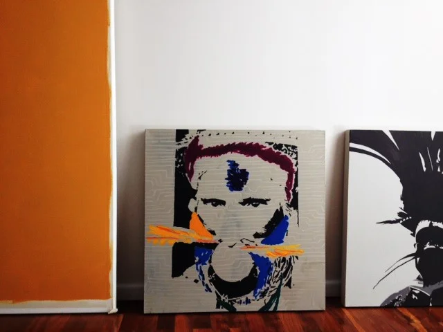
The faces form a separate collection from another area of the commission, not included in Art Shop offerings.
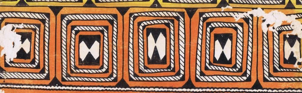
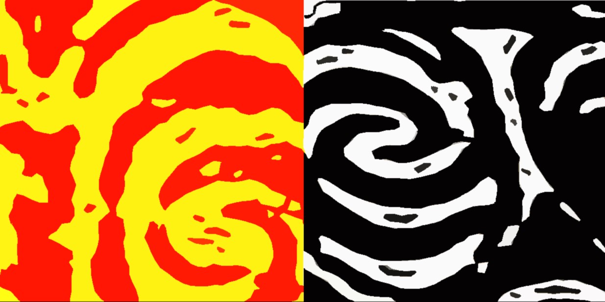
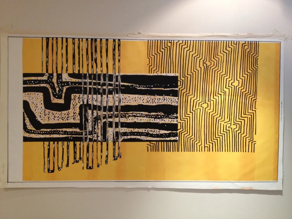
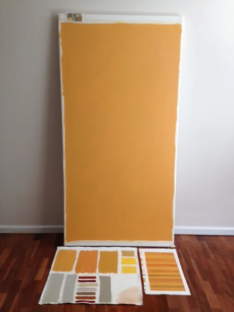
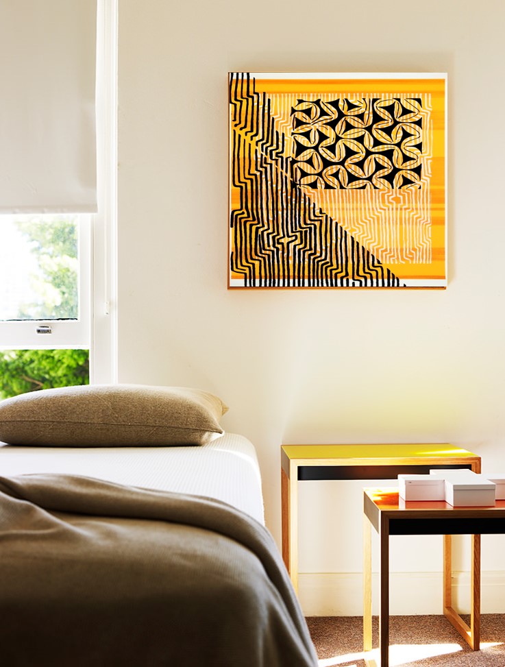
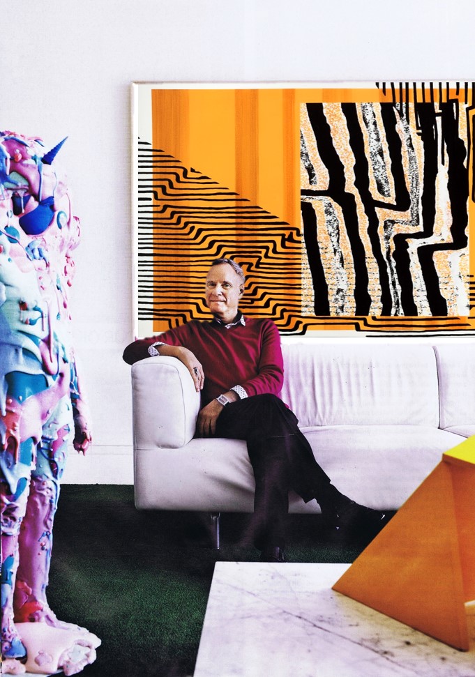
The large yellow/black/white paintings, I love. I banded the solid yellow background, sort of like the gradations of colour that occur in weaving, so each piece is subtly different. Using the white canvas as part of the composition is something I really like in these, the shifts between black/white/yellow have a slight movement so the line work isnt too flat. I like the contrast of the wobbly hard edges, where one colour meets another and the marks that have obviously been hand drawn are rendered with very crisp sharp edges. It was an '8-bit' kind of aesthetic which was deliberate; PNG may be in the 21thC with the rest of us but most of the art one associates with it is more naive folk art in approach. So my pieces are quite contemporary in feel but clearly "in the tradition of". Sharp lines /wobbly areas. Know what I mean?
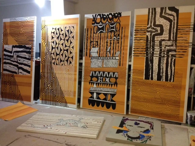
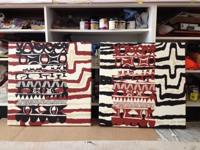

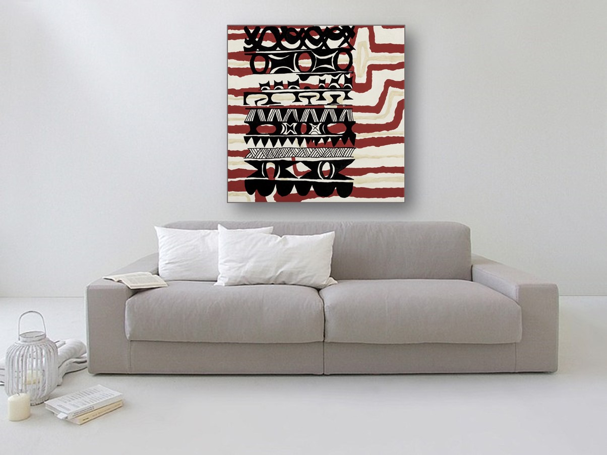
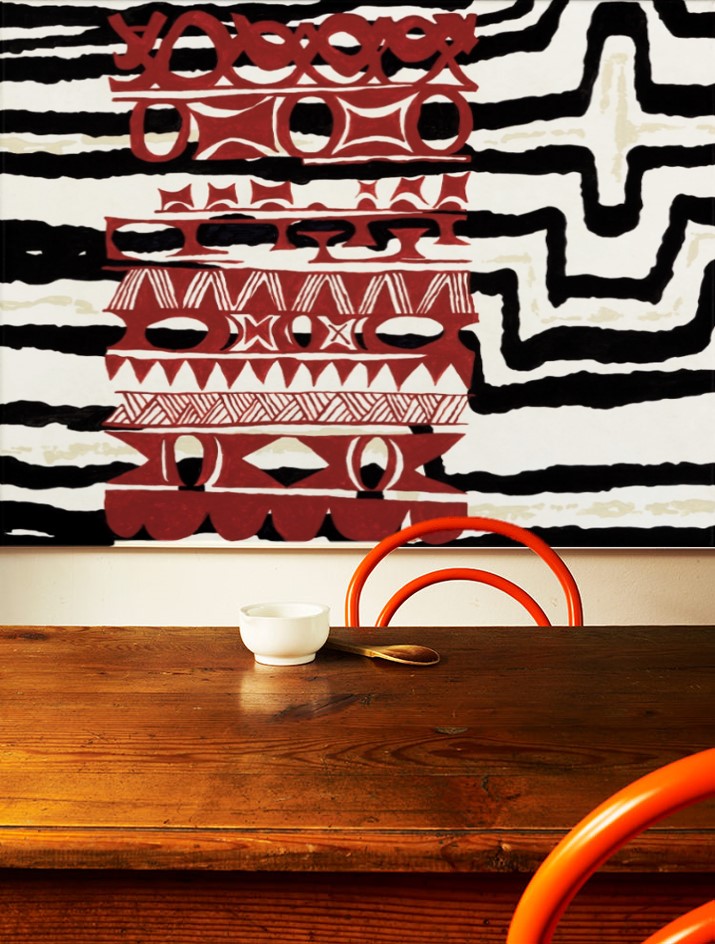
The smaller square pieces are lovely too, to me the dark red used reflects the colour of the soil in PNG; many family bbq's were held at Varirata National Park, quite close to the Kokoda Trail.
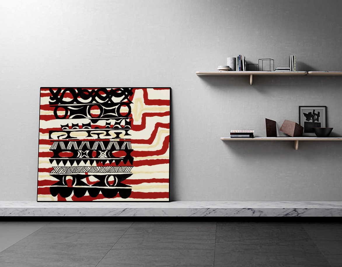
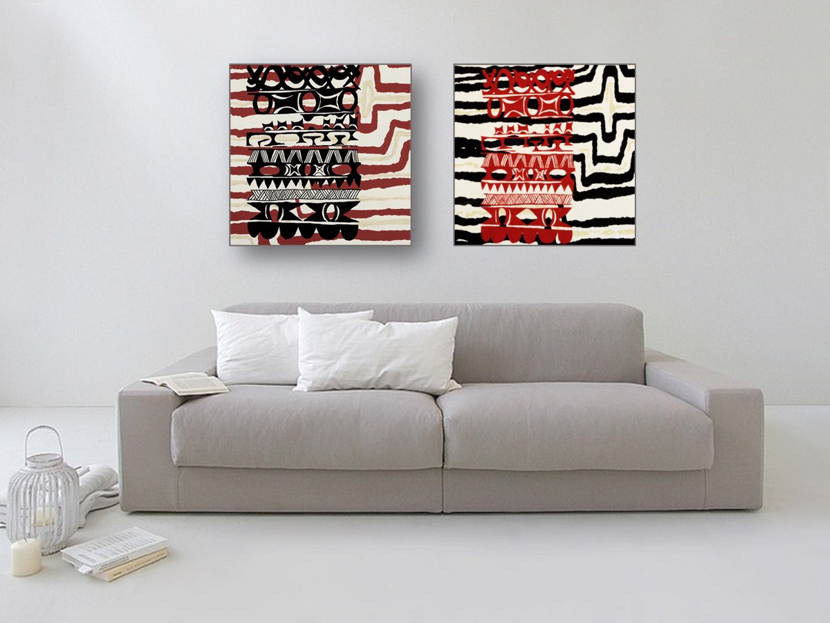
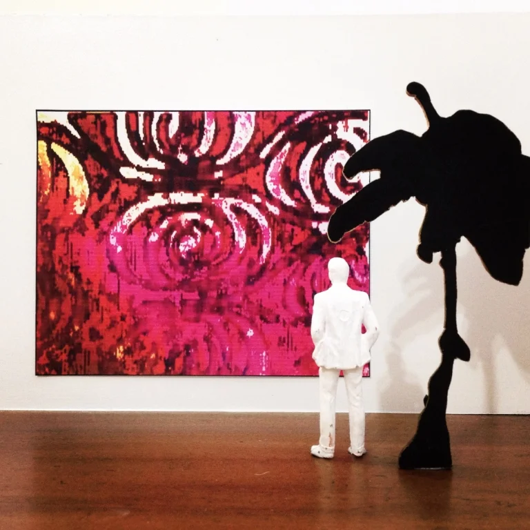
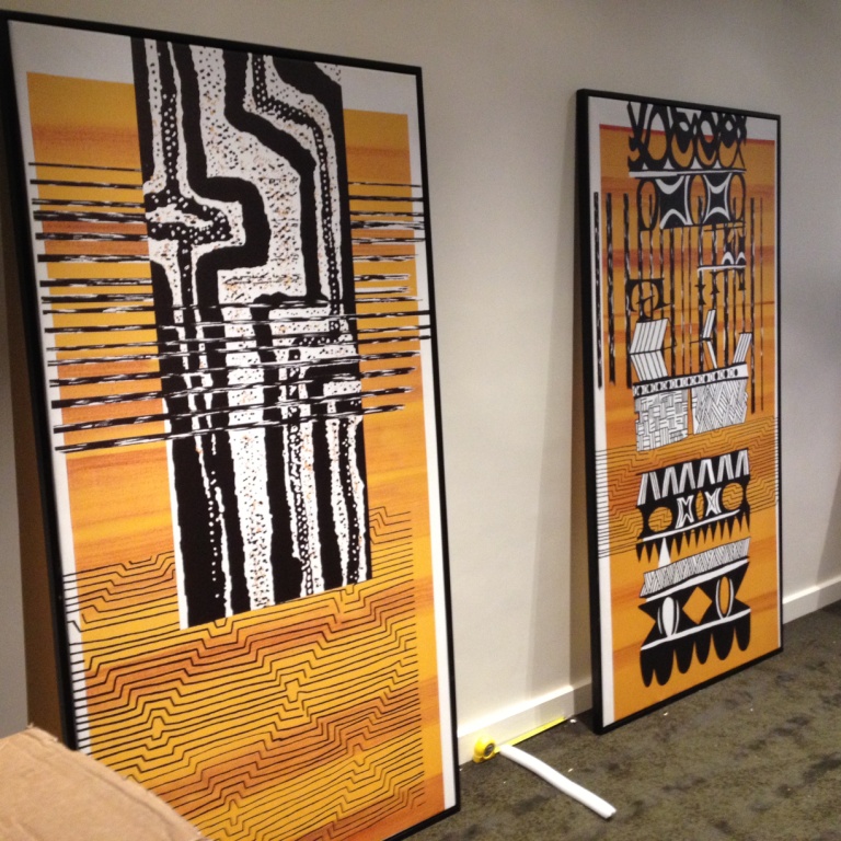
All the prints in this first collection are available at custom dimensions, did I mention that? Here are some mockups I've played with for a few design ideas and with that, I'll wrap up this brief (or as brief as I get) background filling in of the Pop Tribal Project. I hope you like the work but even if it's not your cup of tea (as it were), I hope this post is mildly diverting as a read, and has done justice to this significant (for me) art commission. Did I mention that I loved this job?
My expat childhood has been made mention of all over this site so a commission like this with a lot of (my) emotional background involved was always going to be a special one. And y'know, I've written this post soooo many times and have never been ok with how I've presented this job as regards my personal history. But this is about my work so I'll leave all that out. I end up getting maudlin about it all nine times out of ten anyway so I'll assume you're thanking me for that. You're welcome.
I'm amazed at the opportunities that continue to open up to me because of this project (there are other artworks not shown/offered here) and I'm really amazed to be in a position to set all this down here and offer it up, Making it was a lot of time and a lot of work and it was good work!
Selected artworks are available in ART SHOP! I hope you like it there.