Maquettes - models of sculptures - are great. Mini sculptures, what's not to love?
I have this idea to make mini sculpture galleries. I'll tell you all about it, just look at the pretty pictures below and read on. It's really interesting, promise!
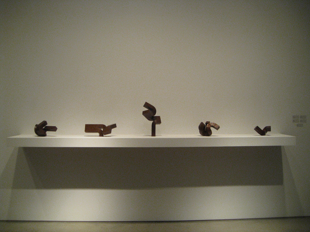
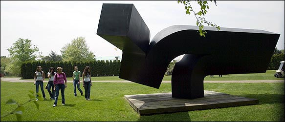
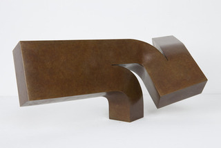
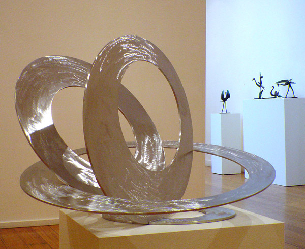
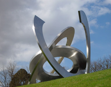
The images below show artist's maquettes and their fully realised sculptures in situ.
Now this project has 2 parts. The first is making a mini sculpture (maquette) and the second is making a home (diorama) for it to live in. As Mr Meadmore himself has stated: “A building is part of the environment, but a sculpture is a presence inhabiting the environment.”.
So the first part: maquettes? These are like working drawings in 3D, made for the purposes of working out a sculpture. Like an architectural scale model of an artwork. In making these, along with ironing out specific technical requirements, one finds out what works and what doesn't visually, before committing to a full size piece. It’s the best and most natural way I know of wrapping my head around a 3D design. So as a means to an end, in designing for a large sculptural artwork, one consequently makes this mini version; and artful model that can be easier to accommodate in one’s home more often that big ‘sculpture-sculptures’.
...and that's cool, right? Long story short: maquettes work really well as decorative art.
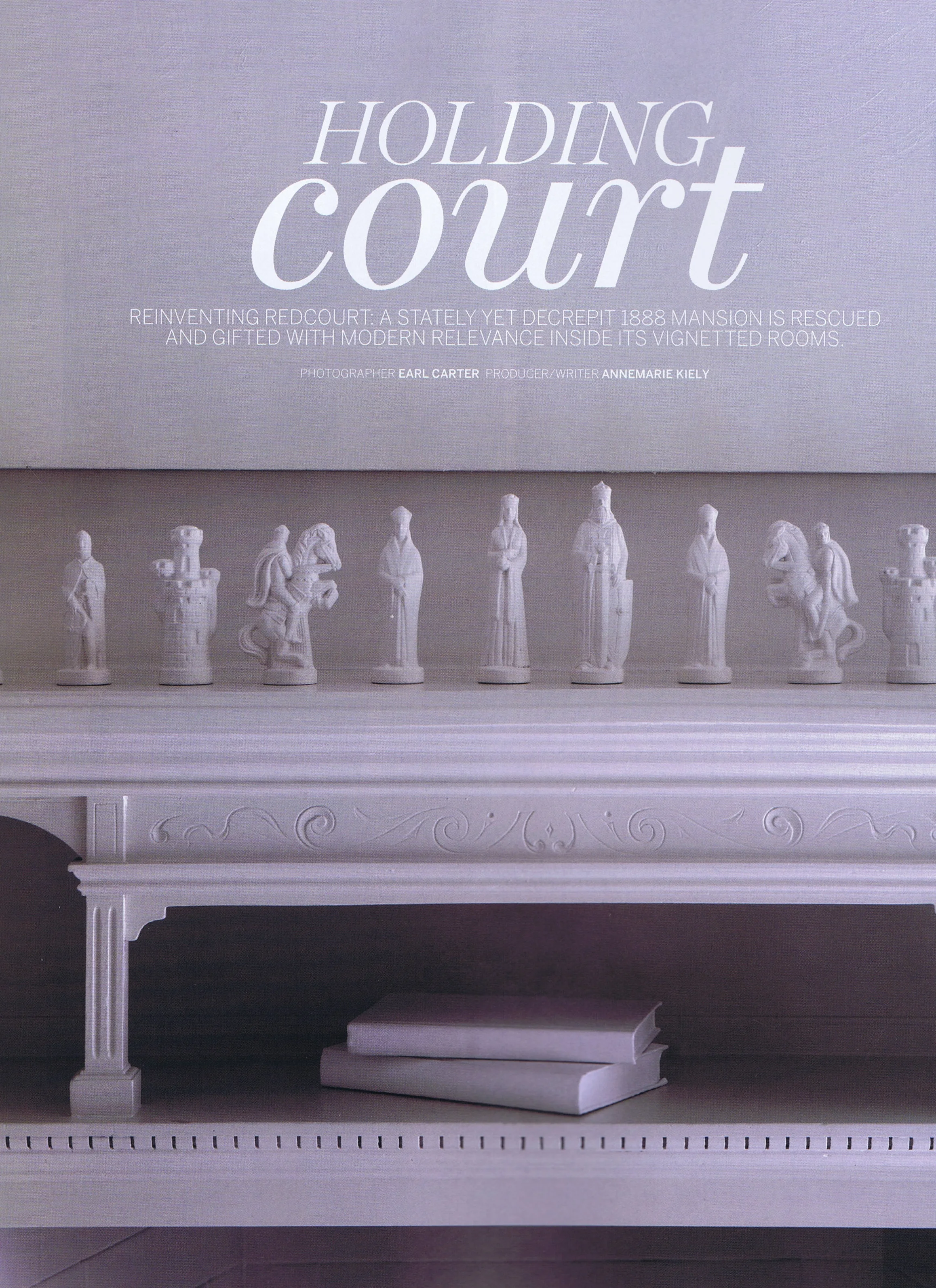
Clement Meadmore's "Stormy Weather". Bronze, 18cm. Looking absolutely absolutely perfect here; Belle magazine oct/nov 2013, in the home of Ronan Sulich & Margaret Nolan.
As for the second part, the display component of this project, it naturally follows that all artworks look best when given a good space to live in. A good sculpture has a presence which requires one's respect and consideration as to its placement in any environment. Although I guess its true that if a sculpture 'works', it should technically be able to stand alone anywhere, given a suitably sensitive home it is more inclined to 'work better'. So I will create a suitably appropriate domicile of my design for my maquettes.
I’m thinking this because over the years I've made and kept a few small sculpture proposals. They're just sort of hanging around. But with a sympathetic background, there would be much more flexibility in where I could display them and they're more likely to be able to work in an already-occupied-by-other objects area. And I have to be really careful or I’d clutter my home and studio with heaps of stuff. It requires a concerted, hard line curatorial effort and decisions can sometimes be torturous: you know, the kind of is this too much? type first world choice. Disgraceful really.
But this way, even on a busy worktop, the pieces of mini-sculpture will stand alone better when displayed in their own environment, portable style. They'll be better equipped to manage a more diverse range of potential homes. Which makes them more decor-adaptable! I can get around myself so well.
Sure, it's 'styling', but why not? There's a battle won, quite often, in presentation alone, and we all know it. Like seeing a collection of porcelain milkmaids in a slick minimalist apartment (for example), meaning is lent to a scenario when there is a dialogue between object and its surroundings.
With all objects of decorative art, context is everything. (No, no please don't say ironic, pleeease, no.)
So yes I can get around this a bit with a diorama/custom backdrop; I'll be manufacturing a contained dialogue by suppling my maquettes with a custom made environment
By way of illustrating this, below are the first concept mock-ups for this project of mine, done in the heat of this moment, collaging on my laptop: using an image of empty gallery space + maquettes.
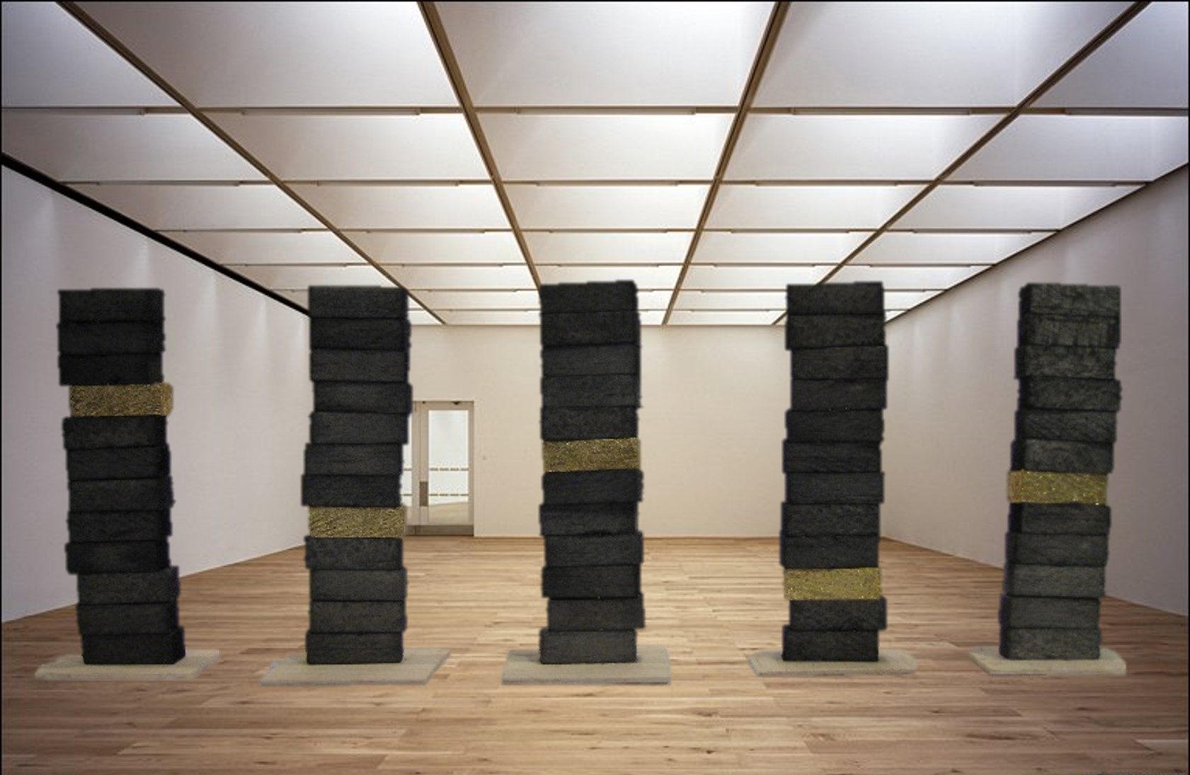
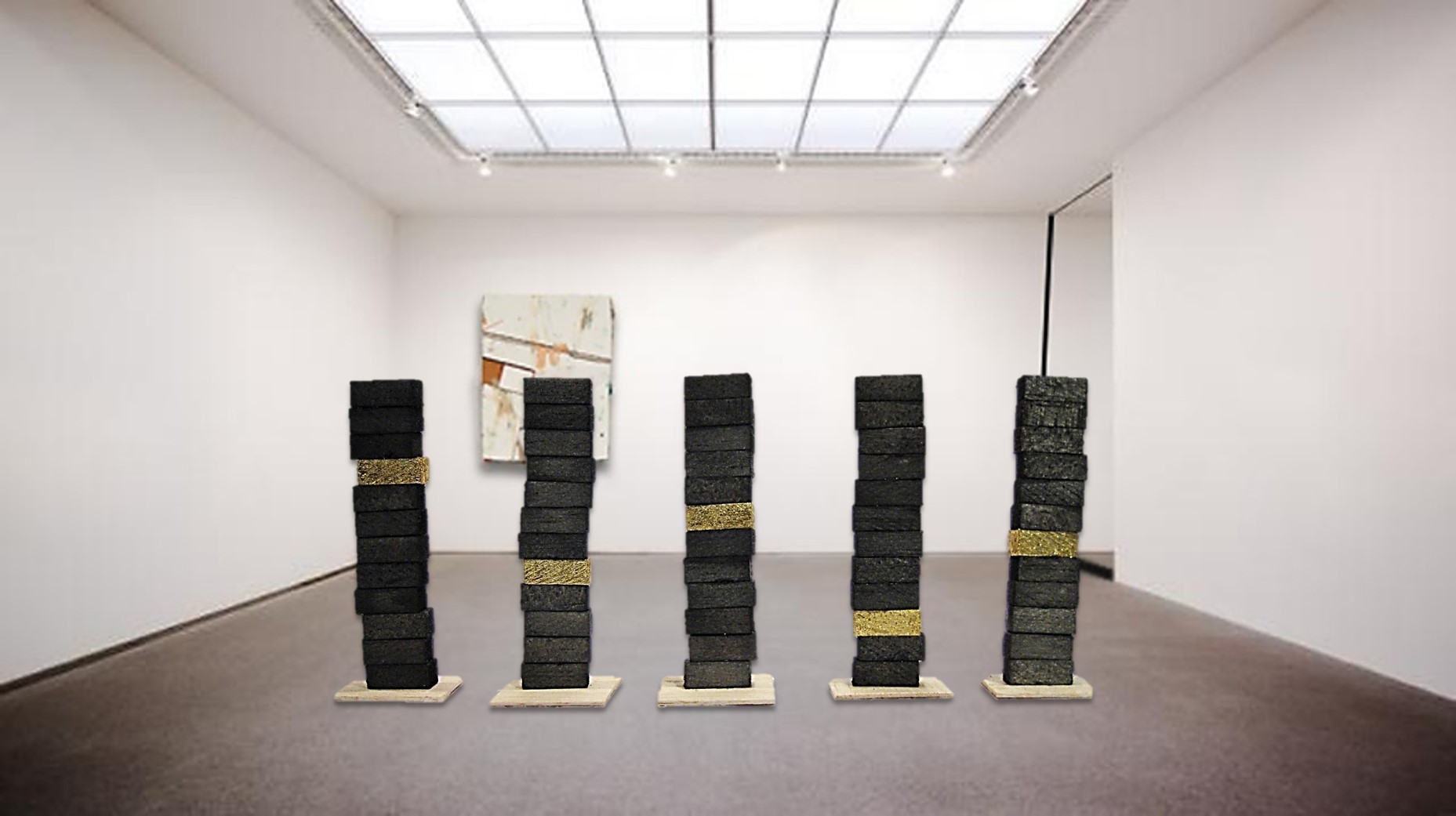
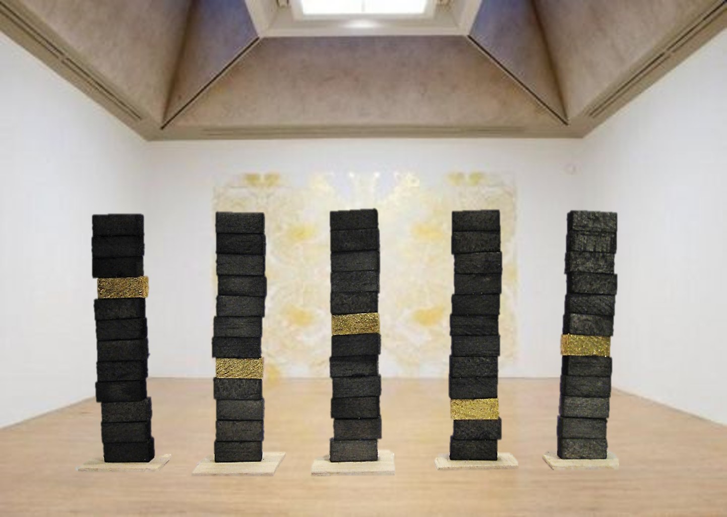
The maquette used in these images above is one I made a few years ago, when I'd been asked to design a series of large sculptures for a luxury resort. The story of this piece demonstrates well the use of maquettes as an invaluable tool for pitching a concept to clients, by the way, as I shall digress and explain.
These side by side photos show the sculpture concept versus the end built result.
This design was selected by the project control group (decision makers), for it's simplicity I suspect. In fact it won the day over some far more detailed & 'arty' alternatives I proffered. There's not much to it and a drawing alone probably wouldn't have got it over the line. (In fact a drawing wasn't even offered at the concept stage.) So it was approved. Can you see why a drawing wouldn't convey the same spirit as the little model? The success of the small pieces is perhaps due to the humble nature of the materials; with nothing more than pre-cut little blocks of Balsa wood, the collection of stacks is ordinary/basic/simple yet lyrical. Quite charming. It 'sings'. See?
Of course, as a sketch, it's useful as a concept only; in practice and given a very limited lead time, structural issues were really worked out as the build progressed. This was more complex than it might appear as the piece had to be transported across the (big) country in pieces for re-assembly on site, complete with pre-engineered plinths with inbuilt speakers & lighting. The difficult realisation work - building the damn things - was undertaken by an incredibly dedicated team of artists; my contribution was concept and consultancy only. (Yeah, the spectator/critic, dontcha hate on them?) But a team effort it had to be, this one; do you know how damn heavy Australian hardwood is??
The design of this sculpture is simple, it fills the brief effectively and there is a certain appeal in the randomly regimented wooden block stacks and the strong colours, for sure.
For my part, I worked to a design brief which was captured in a word: “Splinters”. The visual reference was a group of narrow, vertically mounted, straight edge/rough surface stone columns. The scale was pretty big and in the end was quite monumental, given the weight of the hardwood selected through the design process. It was further specified that the artwork make reference to the geographic location of the resort, to be achieved by using a natural/native material, ie stone or wood, as a primary feature. This also predicated that the colours be wood-ish or ston-ish, y'know. Additionally, a bit of bling was called for, as this is rather glam and pricey accommodation.
So like I said, in order to make sense of this, a maquette was essential in order to bridge the gap between concept specification and the real thing. Hence, this maquette. Which won the day.
See, the thing is, people will respond more immediately to 'actual things'.
Real materials and processes resonate with associated personal and historical meanings and while the digital world continues to expand into more and more areas of our lives, this profound human need to re-experience the actual and tangible arises, stronger than ever.
Fast forward a few years later, the sweet little model, which remained mine, lived in my studio, hanging around, being moved from desk to bench to shelf & onward to dust collecting. But looking at it again....the idea for making a display indicating the intended finished scale for him, appealed to me; I could re-visit the fun part of the job, the mucking-about -with-bits-of-balsa-wood part! What's not to love about balsa wood? Bloody great stuff and too often overlooked.
And...thus this project sprang. (sprung?) Came to be. A little fanciful studio time beckoned and one is a sucker for that.
In fact, I'm seeing a whole series of little artworks in their own environments, mini style, since I'm thinking this one little old pile of balsa wood might be a bit more useful and more is better than less! (Explains why I have regular clutter clean outs at my place...)Moremoremore is on its way, yay! Sculptures and dioramas, mmmmmm.
As final encouragement, there's the wonderful comment by art critic Herbert Read that "sculptures must persist as objects of contemplation." So let’s keep 'em around. Beautiful.
So the next instalment on this project will be the making some of these little sculptures, (titled "timber sculpture" - gosh - for now.) I'm making them specifically as 'little sculptures' for this project but I'll call them maquettes because I'm envisioning them as le grande scale. Then after that I'll look at the dioramas! That'll be fun, I've never made any of these before!
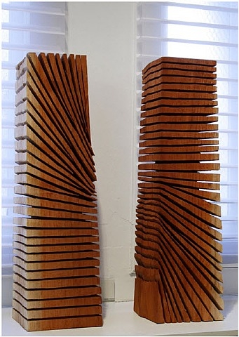
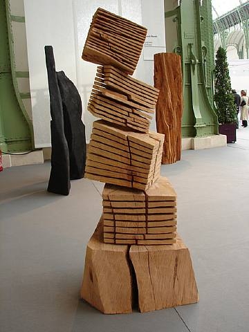
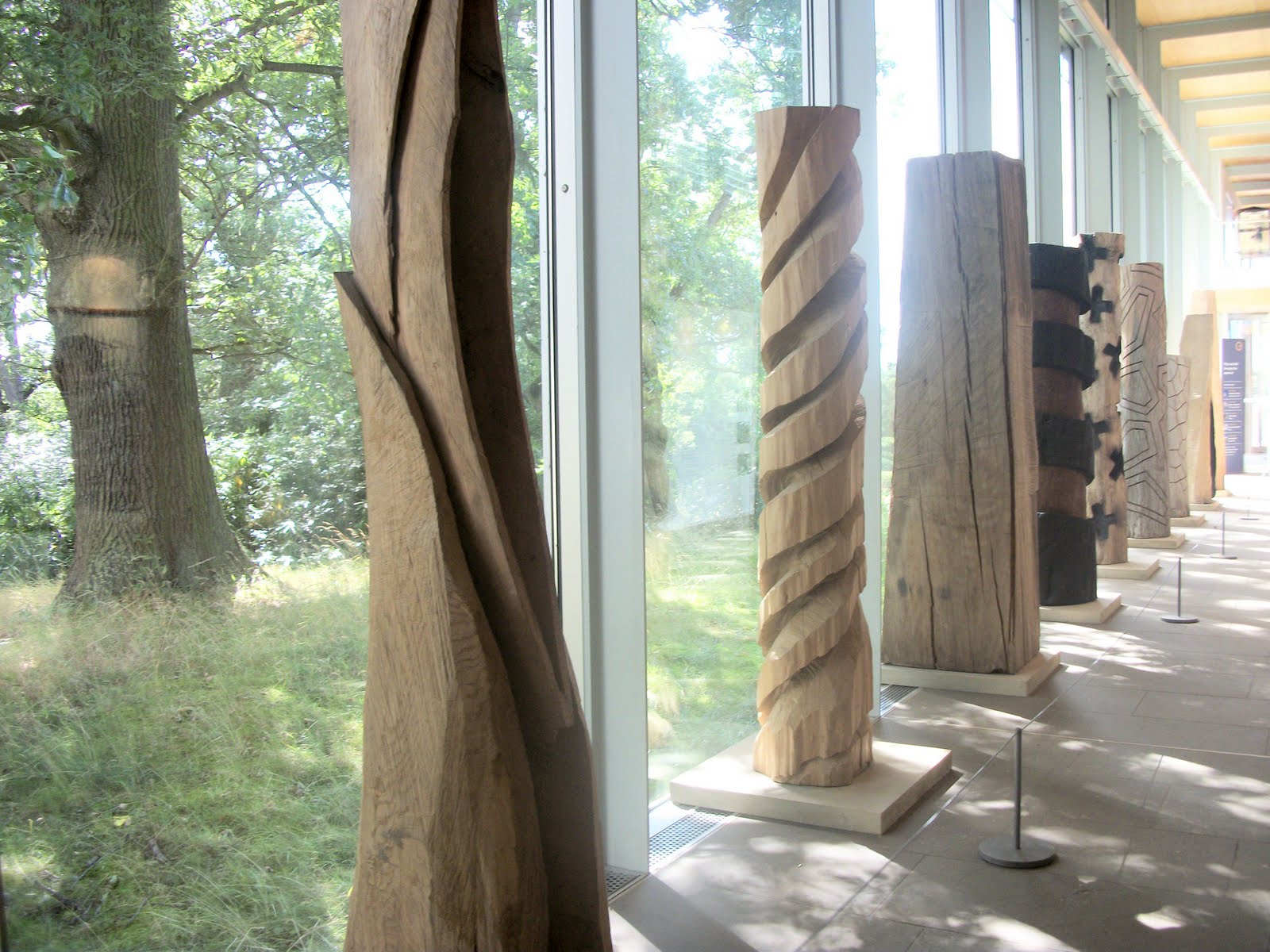
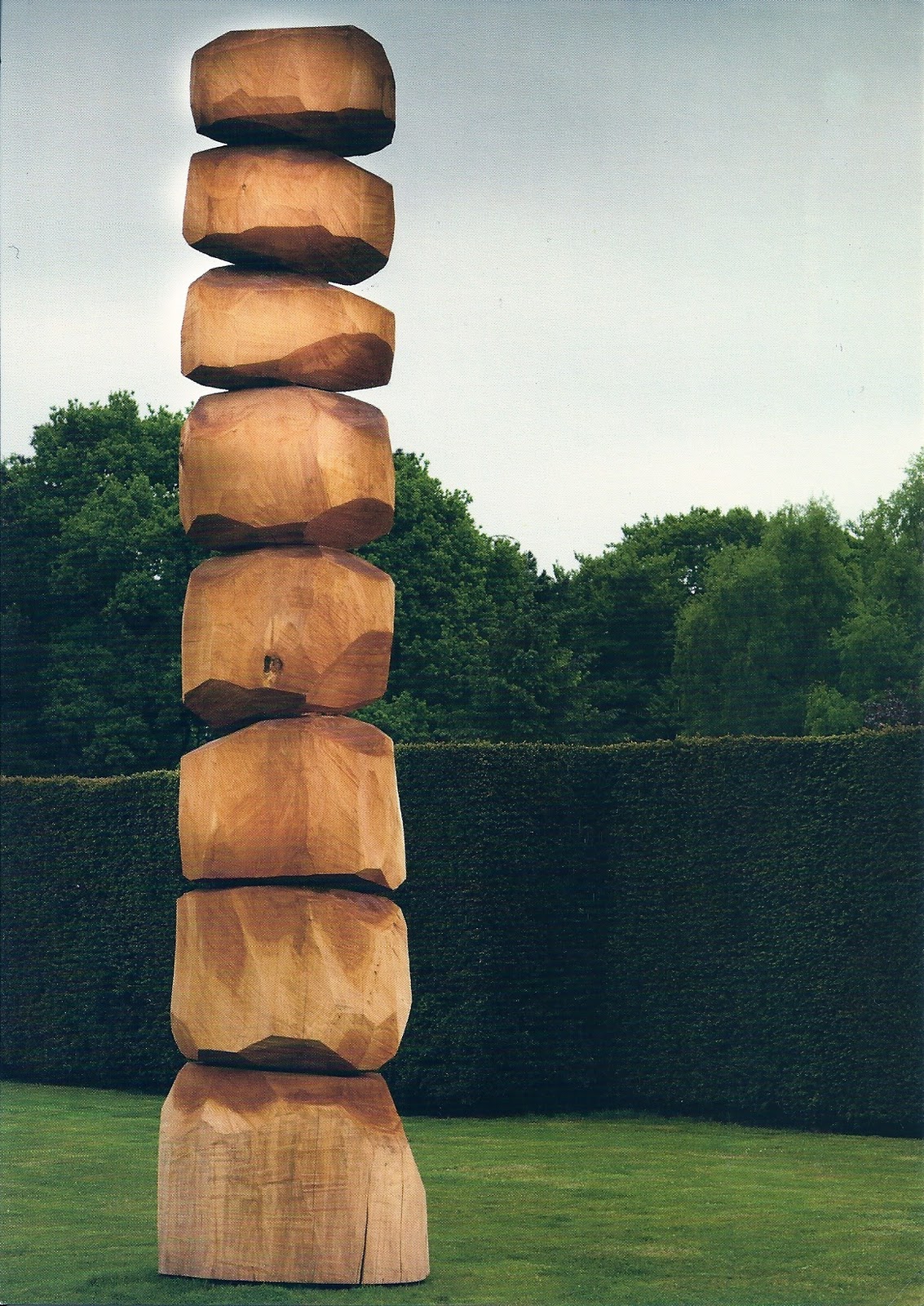
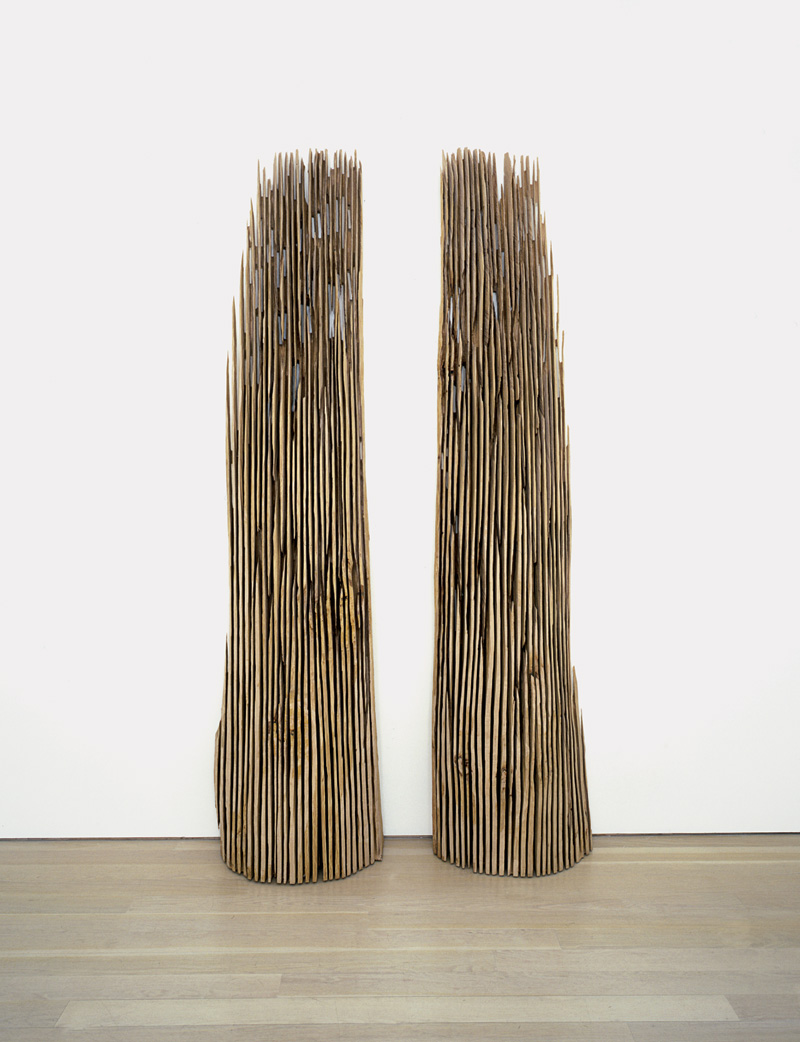
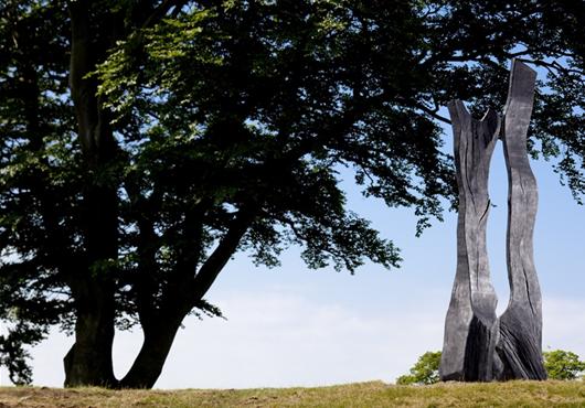
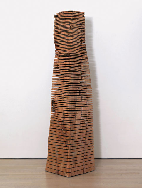
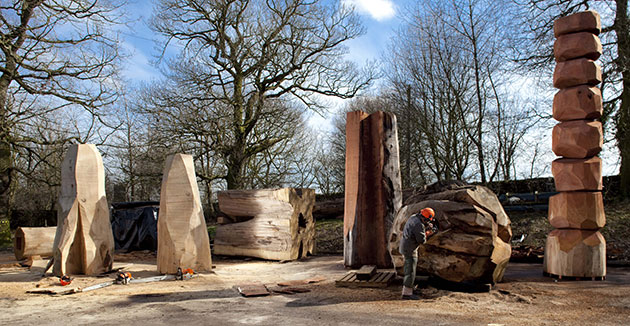
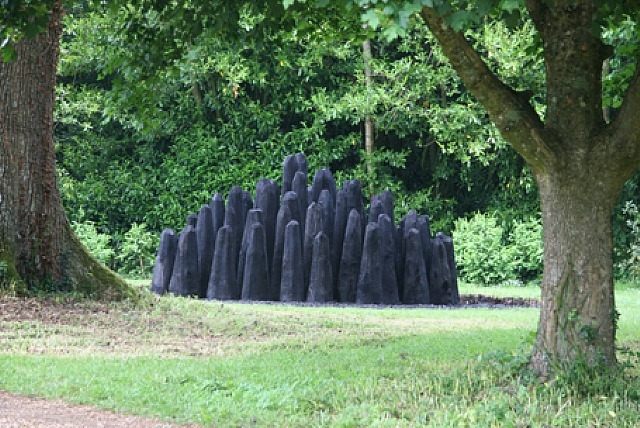
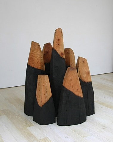
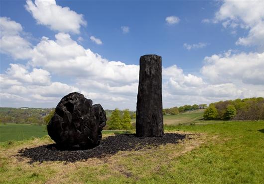
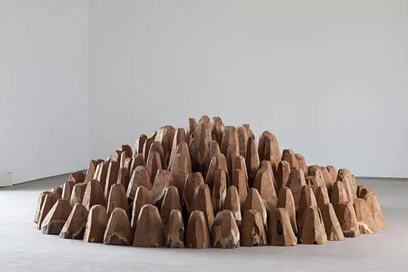
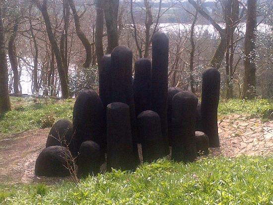
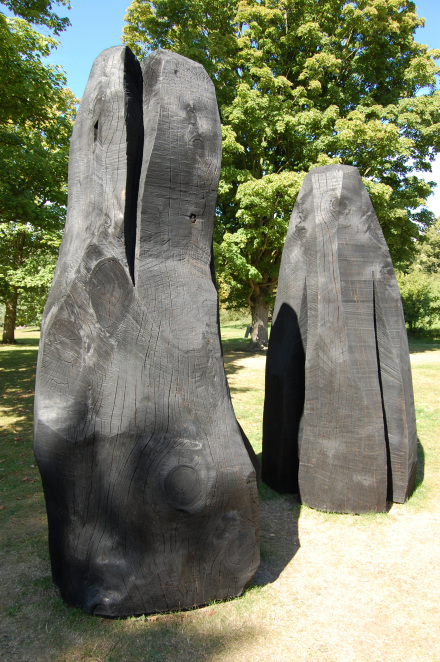
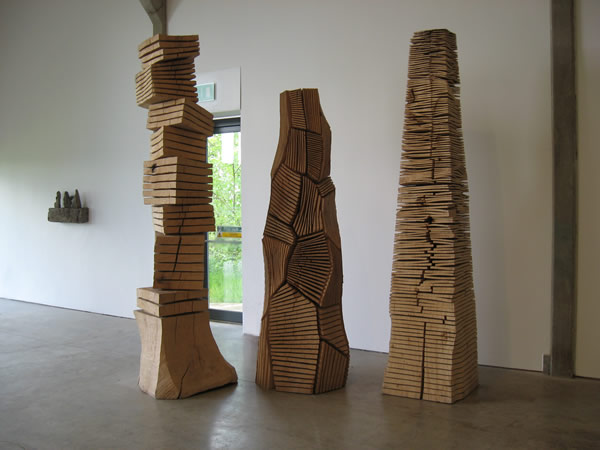
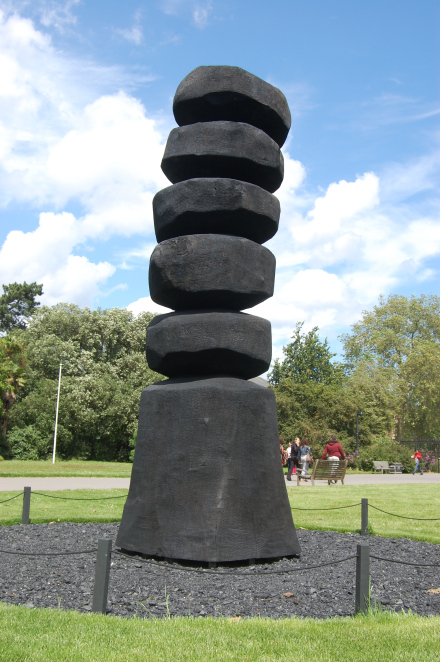
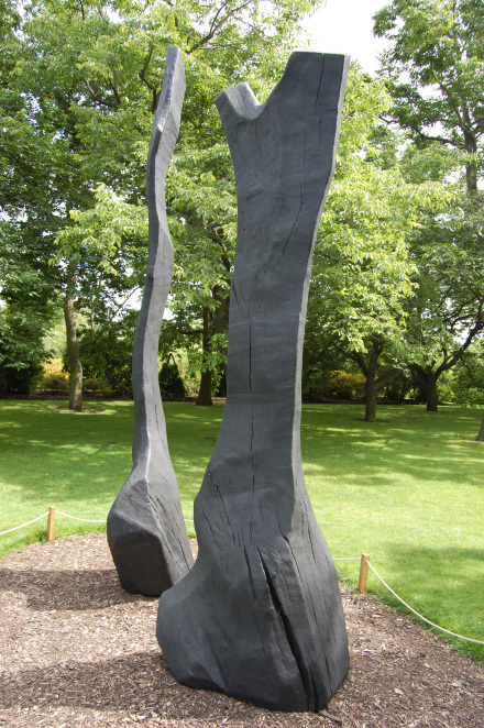
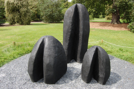
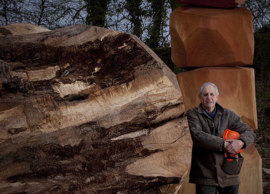
This has been a long explanation of a pretty simple idea, but I'll finish this post with images of David Nash's incredible timber sculptures that I know I looked at as reference/inspiration when working on that resort commission. David Nash is amazing. His work has a powerful presence. Dignity, beauty, spirituality, the world and us in it...David Nash's sculpture is about time and it's wonderful.
