Pretty pictures.
Portrait 1. Acrylic on metal leaf.
Making a picture on a gilded canvas base. (Click here for my tutorial on gilding a canvas.)
Sounds promising...everything looks better with gold, I've always thought. It's just so shiny.
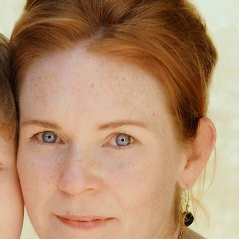
Hmmm, the portrait subject content. Yes yes, me again. Jeez! This one's a present for my Mum's __th birthday. And if I'm going to do this kind of thing, of course I'm gonna choose the most flattering pictures ever! Sheesh!
(For some tying of oneself in knots about this, see the My Little Artworker post. By the end of that, this whole self portrait thing was looking pretty dodgy to be honest.)
So, having begun with a pre-determined plan of a gilded background and a good photo of oneself, I had to work out the design.
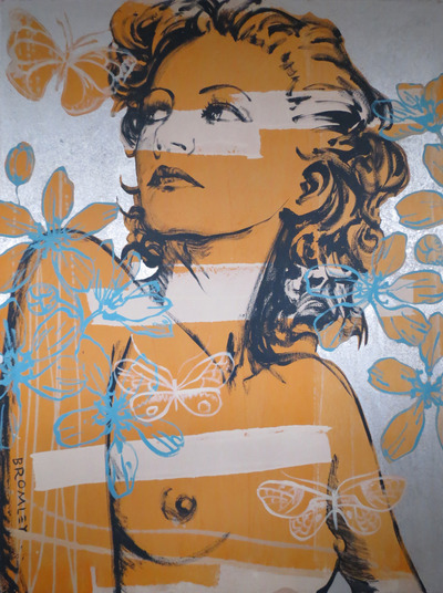
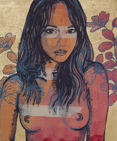
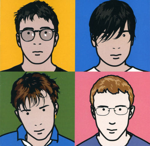
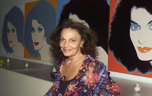
It happens that I've recently been looking at portraits by Julian Opie, David Bromley and good old Andy Warhol.
"That Warhol created the model for so many of today’s art practices should be obvious to anyone conversant in art of the last 30 years. In his 1975 book, The Philosophy of Andy Warhol (From A to B and Back Again), Warhol made the first of his notorious statements about business and art. He wrote: “During the hippie era people put down the idea of business—they’d say ‘Money is bad,’ and ‘Working is bad,’ but making money is art and working is art and good business is the best art.” " source
Andy Warhol with Debbie Harry at the 1985 Amiga Launch at Lincoln Center. Fascinating article on computerhistory.org
Both Opie and Bromley have readily acknowledge the influence of Andy Warhol on their art practice, both have developed a 'signature style' and have become widely known for portraiture. Bromley has even been described as having *"fast become Australia's Andy Warhol, creating instantly recognisable portraits of society's leading figures”. And the volume of product that issues forth from the studio of both artists is a lesson learnt from Warhol's "factory", with wave after wave of similarly themed artworks released to a grateful public. source
These portraits, that "reduce subjects to essential lines and color planes, draw on traditional classical portraiture, Japanese woodblock prints and Pop Art aesthetics" Which serves, in effect, to make work that is "just decorative" perhaps, but as Warhol firmly established, the art of choosing the image/s to reproduce is where the art is created. source
But the thing that interests me about these portraits is that if it's to a large extent a matter of formula - starting with pre-existing photographic sources and decorative motifs & techniques - then it follows that said recipe is but a framework for me to exploit with my own personal and artistic variants, too. Computers have made this easily achievable.
Obviously I lack the requisite celebrity, but what is it you think a self-portrait is all about? Great way to get your face known, bro! Hmmm. Ok, this could back-fire on me. Maybe I start saying this is a picture of someone else?....oops.
Main point I'd like to make: I'm simply using a well precedented method of pretty picture making here. And Warhol must be so cross that he died before computers could do what they can do now, and he'll only get crosser as time goes on and the computers get better. Too bad for him, but he gave us a great start.
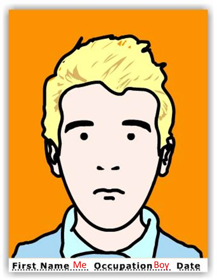
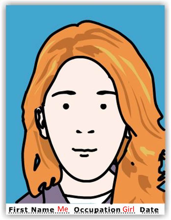
If you'd like to "make your own self-portrait in the style of JulianOpie", click on artisancam for a fun few minutes and DIY it. Its limited fun, sure, but why wouldn't you have a few minutes fun doing this?! (Mine here below.)
After all, Andy Warhol is held responsible for influencing many, many artists, from Ai Wei Wei to Anslem Kiefer to Richard Avedon and these two above. Why not me too?
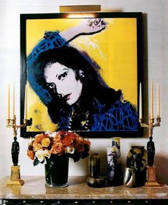
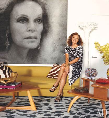
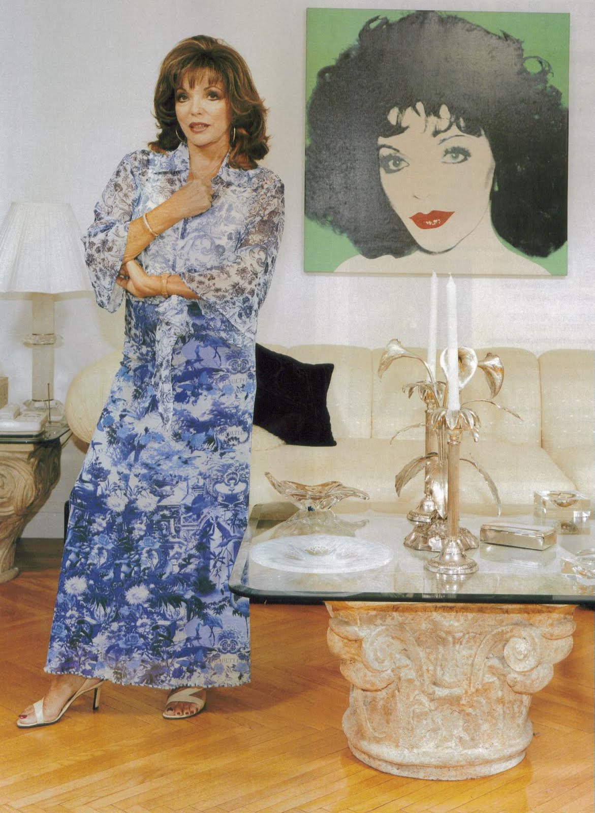
But there's another thing about these Warhol artworks that's curious. I've long found it a little bit weird how some (famous, rich) people hang portraits of themselves in their own homes. Wtf?
So, like I said, for these artworks, I started with the most flattering recent photo of oneself that one could find and then started layered a few favorite images about. DUH. And mine certainly won't be hanging in my house, good grief.
To manipulate my photo, as I have also said before, the easiest image editing ever is available ready on Windows PowerPoint. (I've learnt to use it well by the usual route: many hours learning by trial and error. There really is no substitute. Great instructions to get going with found here.)
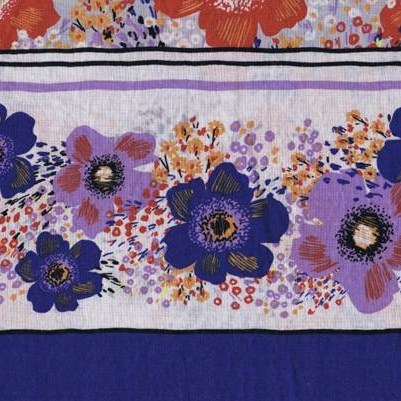
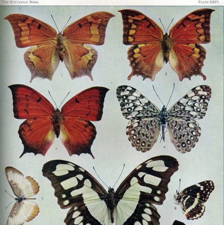
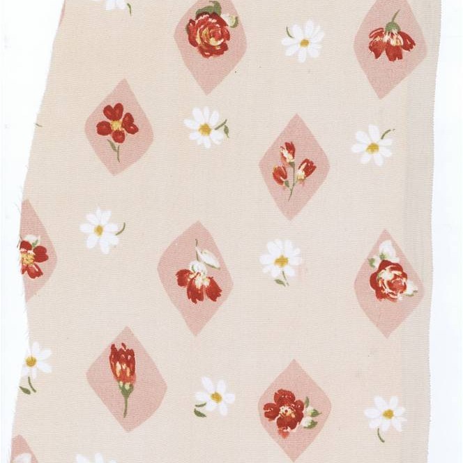
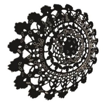
Below are some images I used to collage. The fabric from my stash with the pretty flowers, some doilies found on Google search, manipulated on PowerPoint into a very cool fretwork, gestural marks made on Microsoft Paint, a scan from a library book on Japanese fabrics and a page of vintage butterfly illustrations that my sister sent me years ago.
Of course, as always, I made a few versions before deciding which one to actually make, see below, because it's irresistible layering these things in 100 permutations. Just a couple of clicks make a big difference:
Sometimes though, it happens that an image which works very nicely on screen or paper as a sketch, just doesn't when its made to right scale in real life. So I hedged my bets and made an optional design to make alongside the first and we'll see how the making unfolds. I don't seem to be capable of only working on one piece; the only way I can work is to have several pieces going at the same time. They're all at different stages and I can put them down when drying or at a certain juncture in the making and pick up something else. So it's normal for me to make more than one of anything. And that way there's always something to work on. I'm always working.
Below is "Portrait with Roses".
So this is a square format piece, because that's an available stretched canvas I have in the studio at the moment and it's a nice size, 700 x 700 mm. Below are details of the pictures I again manipulated on Power Point, too easy.
Portrait with roses
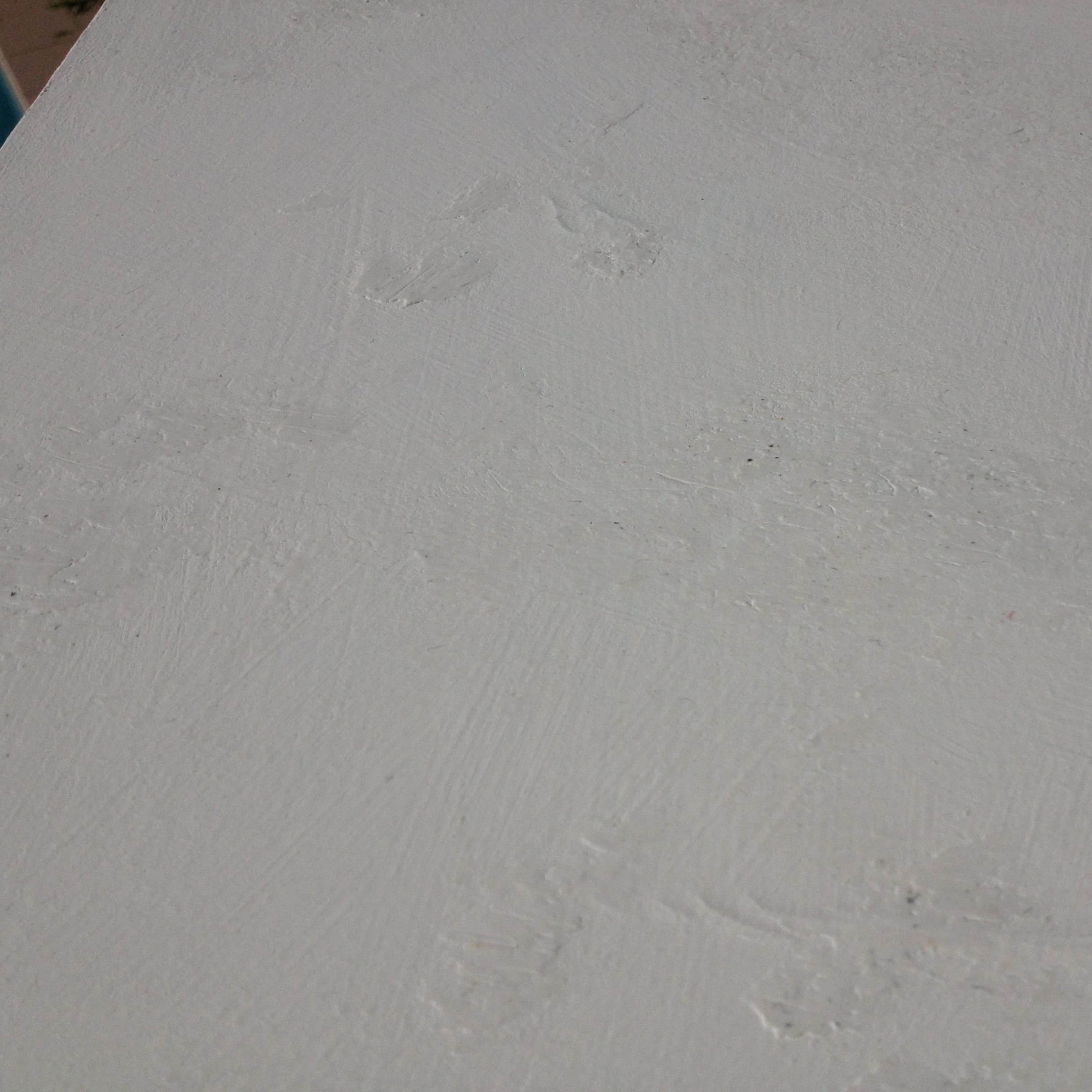
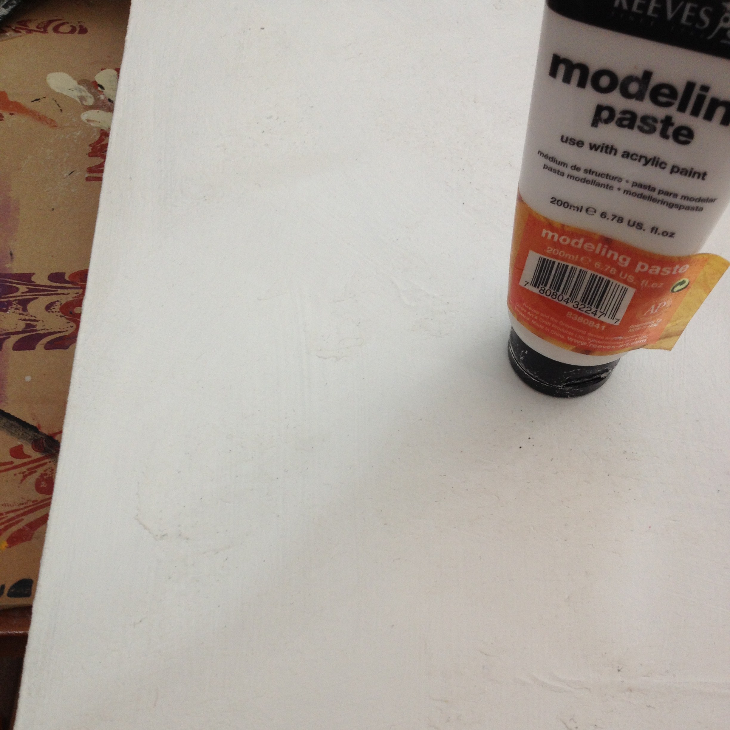
I used another second hand canvas from my stash. I have a few of these which came my way from another, unknown artist.; I literally 'found' them, abandoned, and it's been great being able to dip into this store. It always seems easier to make a picture if the surface has already been worked and by recycling artwork that part is half done. A few coats of white acrylic all purpose sealer (I can only guess as to the materials used underneath, so this is safest bet.) and I have a nice thick, nubbly surface. But I'd like it more textured, so take to it with some inexpensive modeling paste and a household sponge. Another coat of gesso and I have a lovely smooth-but-rough surface. To further encourage it, I rub on some raw sienna and carbon black artists acrylic to catch slightly in the texture and colour up the stark white.
And that's my progress on the roses piece to date, so stay posted.
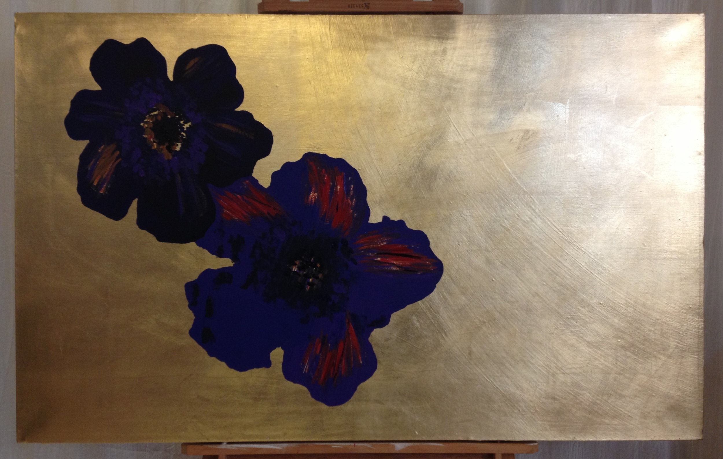
The first piece, the Portrait on Gilded Canvas, in progress as follows:
First, painting on the two blue flowers. Even though these will be largely covered over, I cant be certain precisely where, as placements can change as the piece is made. So I paint them in entirety, in detail.
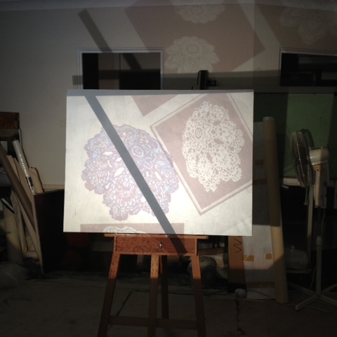
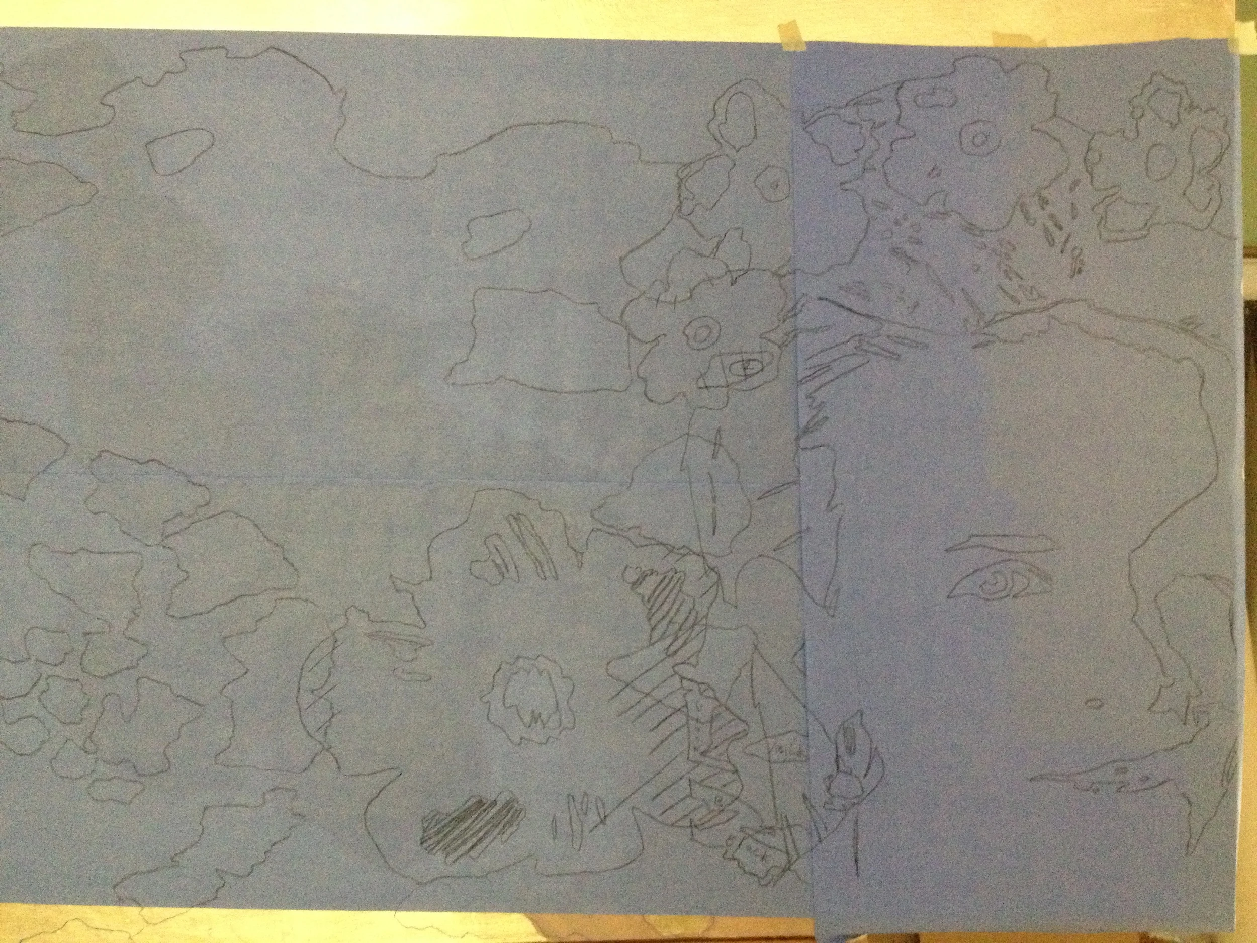
Tracing on the first "doily" by projecting onto Saral paper, then drawing the outlines.
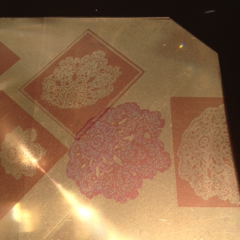
This process as seen illustrated in pics below. Yep, I'm antiquated in my work, a lot of the time. I use an old overhead projector and print my own transparencies. I really like being able to cut & paste almost with image placement & scale. Once these are right (and it can take a lot of transparencies!) I transfer the image by directly tracing from the projection. However, as metal leaf (and some other surfaces) is highly reflective, it's impossible to see the image when you're up close, so transferring the image by placing some Saral or a home made chalk paper on the artwork surface is better way to go. I have heard tell of these new fangled projectors that hook up to a komputer, but they haven't made themselves available in my studio yet. Dammit.
Laying on more tracings.
Blocking in the large doily.
Doily in progress.
Progress to date. Check back for further progress posts..........
....Er, this job has been shelved. The images looked great printed on paper and worked well as the cover of a card that said "Happy birthday". Thats all she really wanted and I really went off the idea of painting pictures of myself. And yes, I'll recycle the canvases.
This project now firmly resides in Past Projects, thanks for playing.
